A White Kitchen Renovation
inspiration
design tips
press features
project reveals
search the blog
Hey there! I’m Andi, owner and lead designer. At Morse Design, we’re committed to creating luxury homes that are perfectly tailored to you and your family’s daily living. With years of experience and a love for beautiful, functional interiors, Morse Design is where exceptional meets the everyday.
Morse Design
Welcome to
We recently wrapped up a kitchen renovation in a townhome community. It’s a small space that had lots of potential. We wanted to create a light and bright area with lots of function and beauty. The homeowners enjoy cooking so we needed the space to work for them. I think the result came out perfect! It’s not only light and bright with function at the forefront, but it makes a beautiful statement to the home.
When we began here is where we started:

As you can see it’s not a big space. We needed plenty of counter space for cooking as well as for entertaining. We wanted to incorporate premium appliances and more storage. We enlisted the help of Cullens & Co. who came up with a kitchen design we loved. She accommodated all of the appliances we wanted and gave the couple lots of counter space for cooking and entertaining. The bonus was a ton of storage.
Here is how the kitchen view looks now:
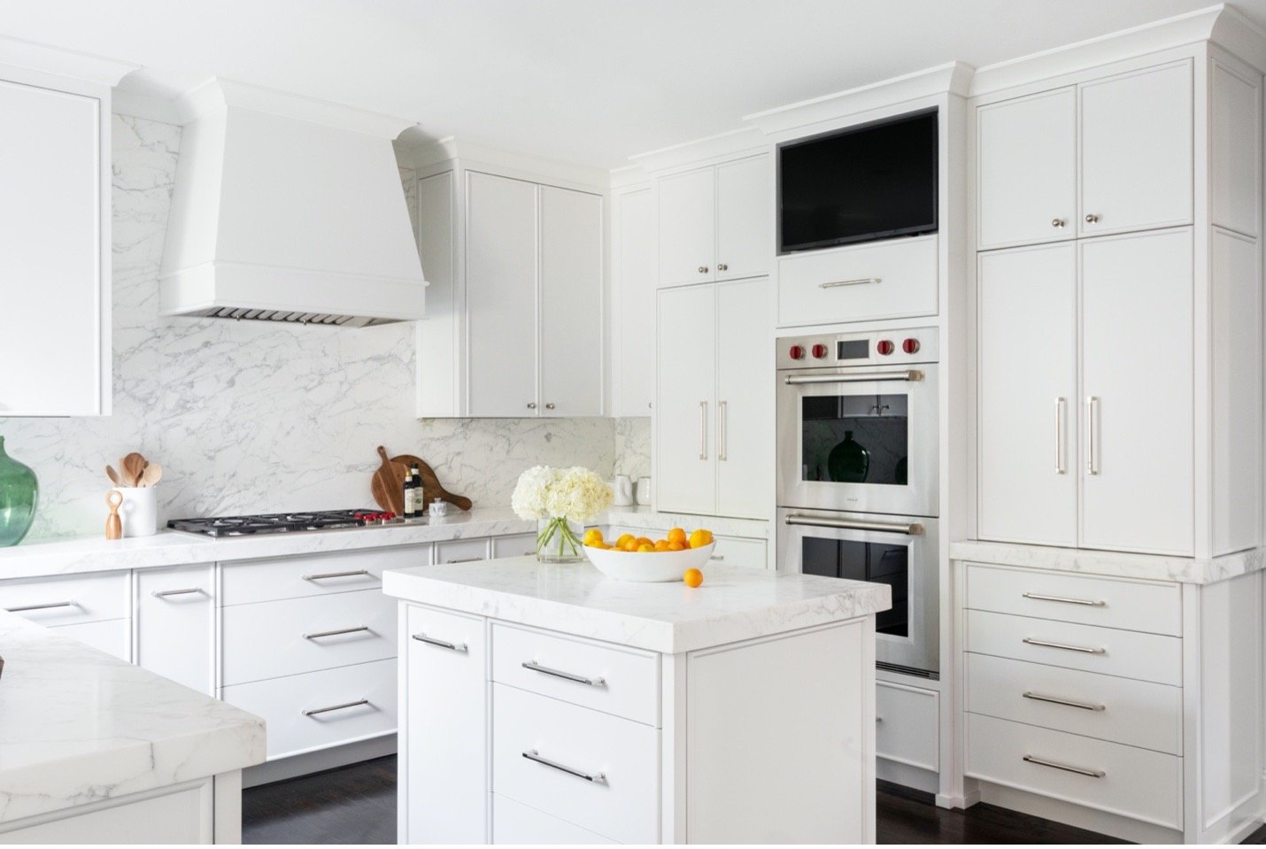
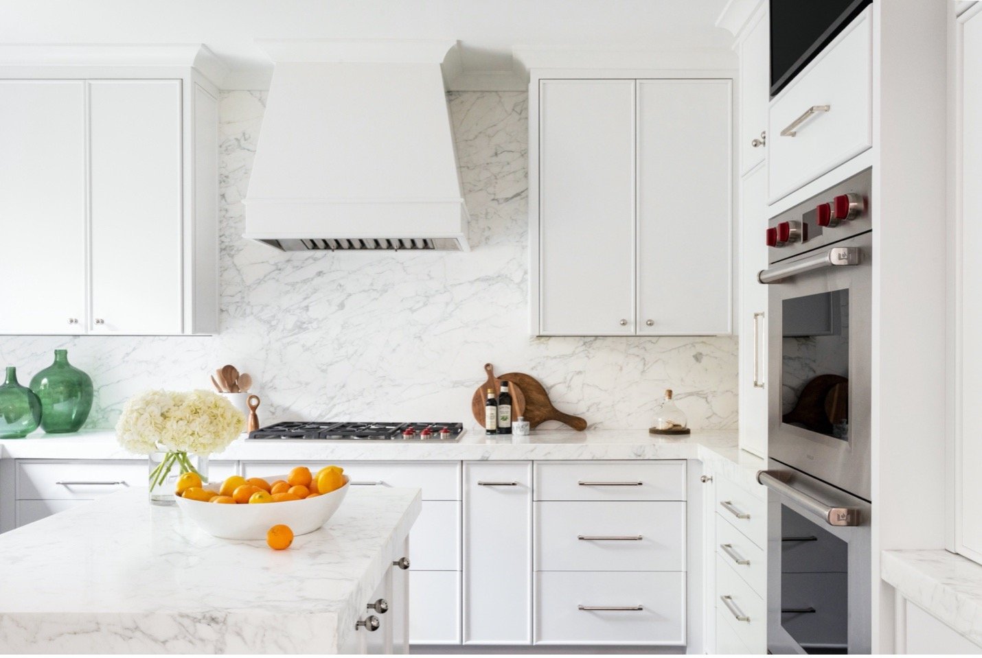
It has a Wolf double oven and range top with a spot for the television to be housed. The island is not huge, but we changed the direction of it and added drawers vs. cabinets on both sides to give the family more storage. The wall unit next to the ovens provides a coffee nook area that also stores the microwave and has additional storage above and below it.
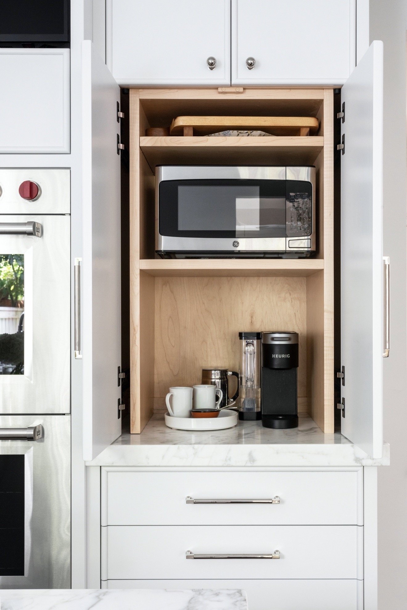
The kitchen had a wall that used to have a desk and shelf unit. Here is how it looked:
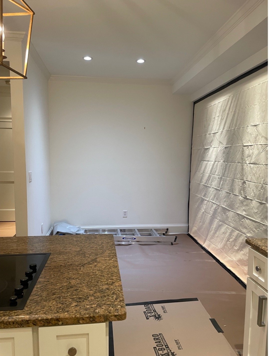
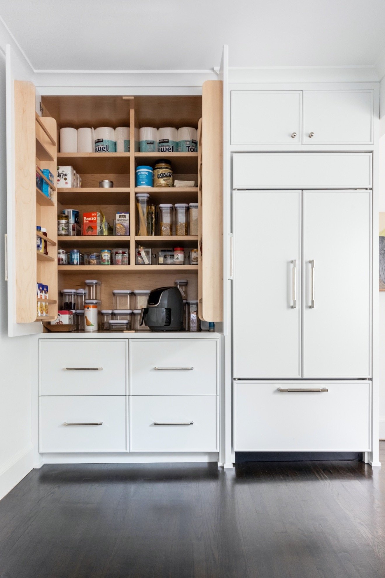
This was a great place to take advantage of and use for storage. The kitchen design incorporated placement of the subzero refrigerator/freezer on this wall. Cabinets and drawers were added to create a complete wall of storage. Here is how it looks now:

It also provides lots of organization on the interior:
Part of the design of the kitchen was bringing more light into the space. As you can see when we began there was a small window that didn’t have much light sneaking inside.

We expanded the window and eliminated the uppers to let the kitchen absorb more natural light and provide a very clean look. Here is what it looks like now:
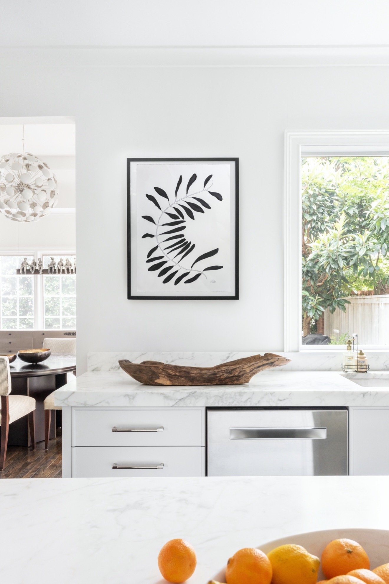
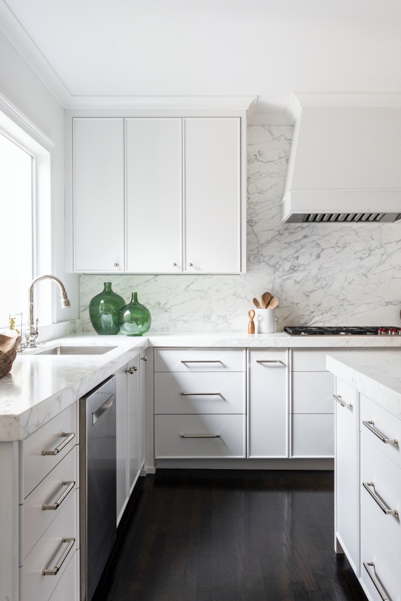
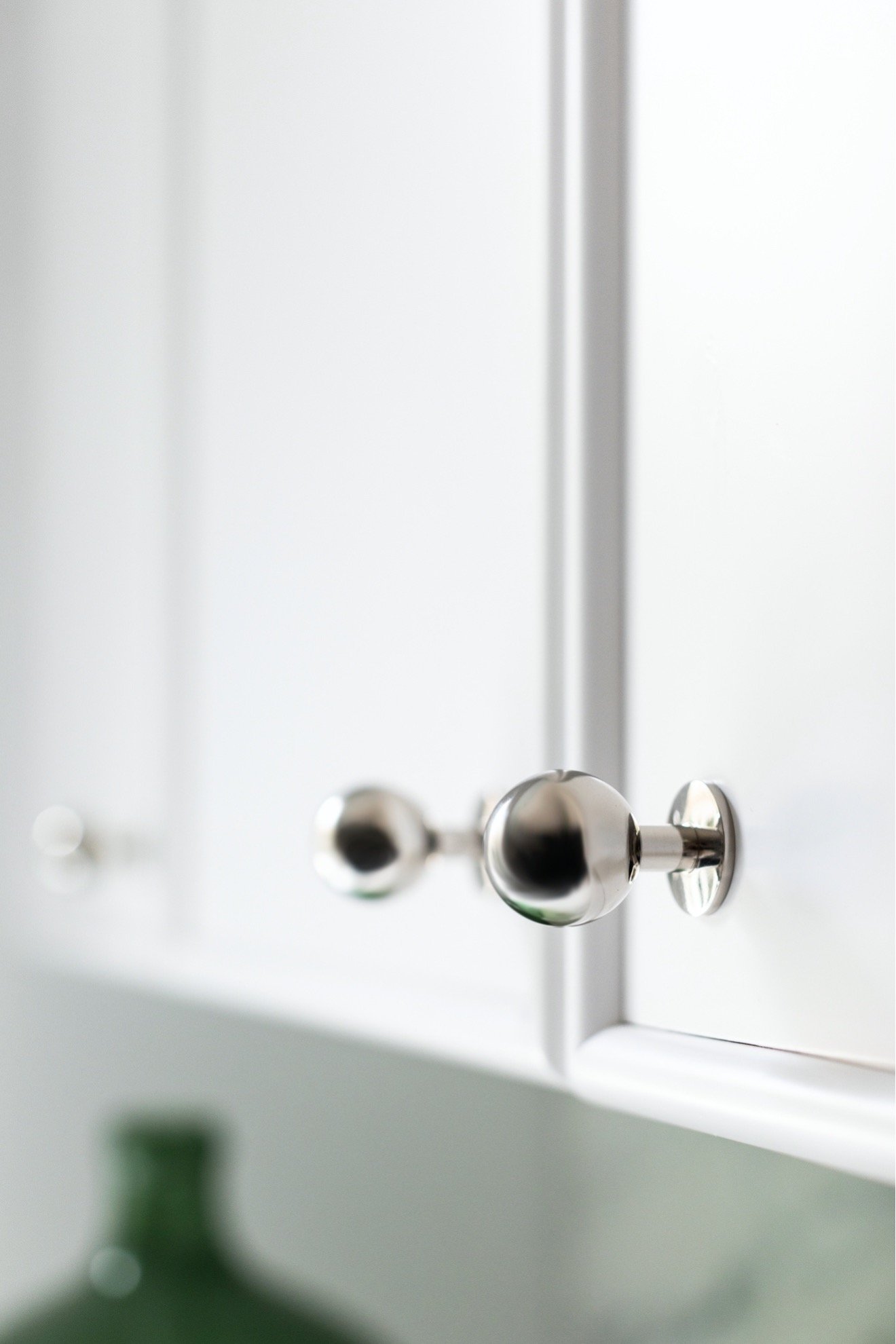
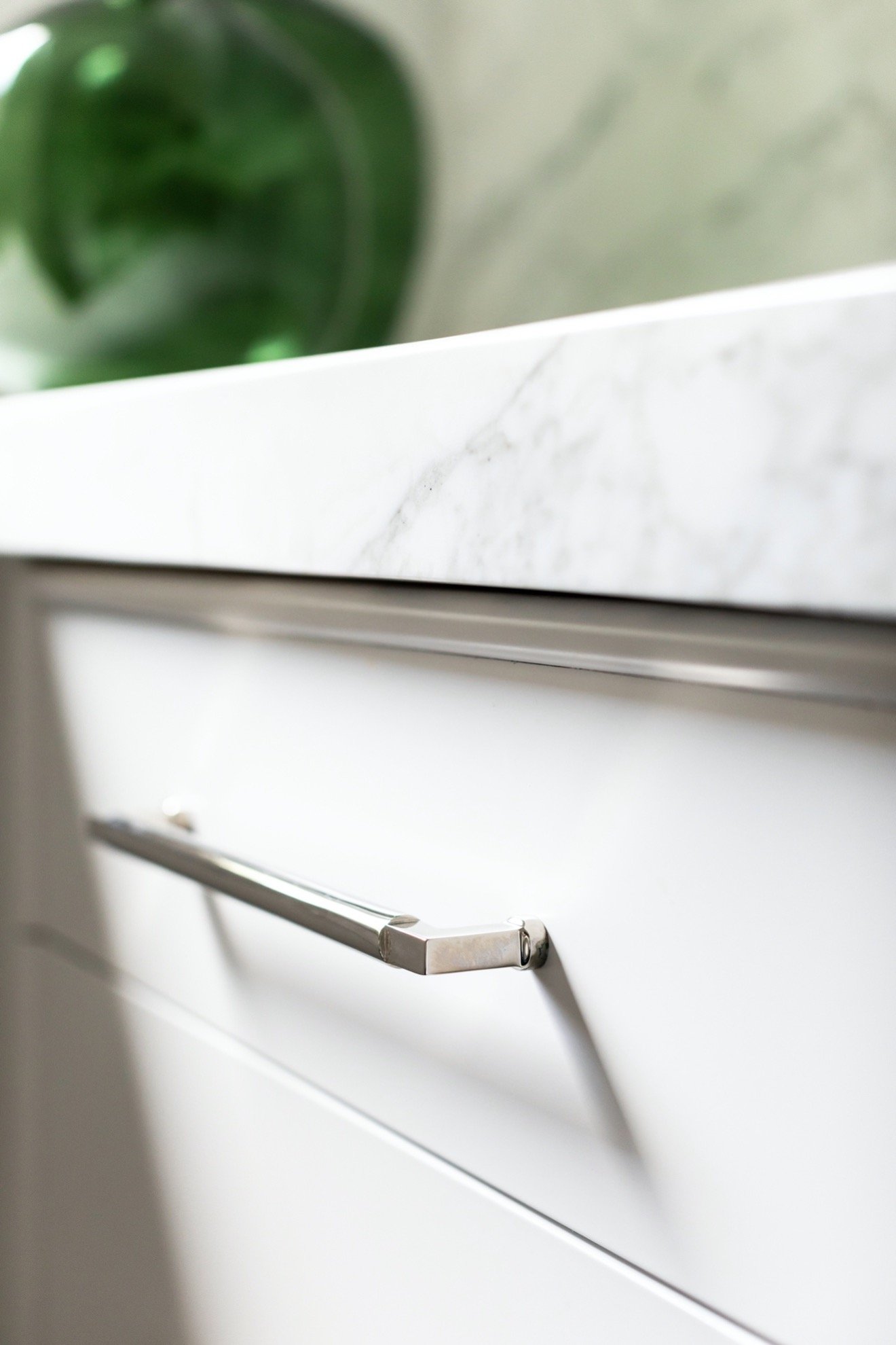
We kept the lines of the kitchen clean and simple extending it to the cabinet doors. There is a little bit of detailing around the edge of the doors, but that’s it. The polished nickel hardware really shines even more because of the simplicity of the doors.
We designed a wood hood and painted it white. Because the kitchen is a small space we didn’t want the hood to overwhelm it. Keeping it simple and white helped make the kitchen feel larger than in reality and also let that marble stone be the highlight.
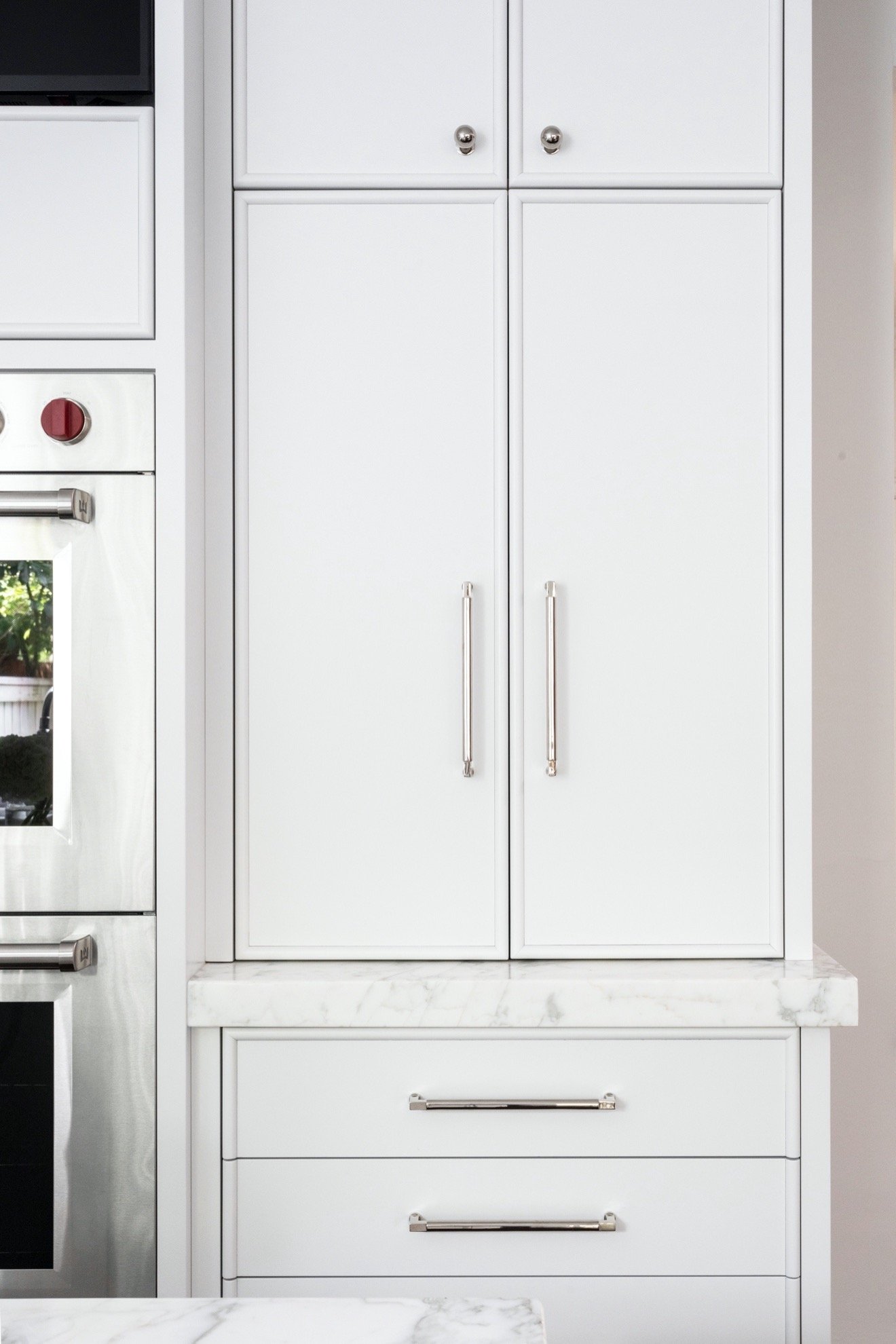
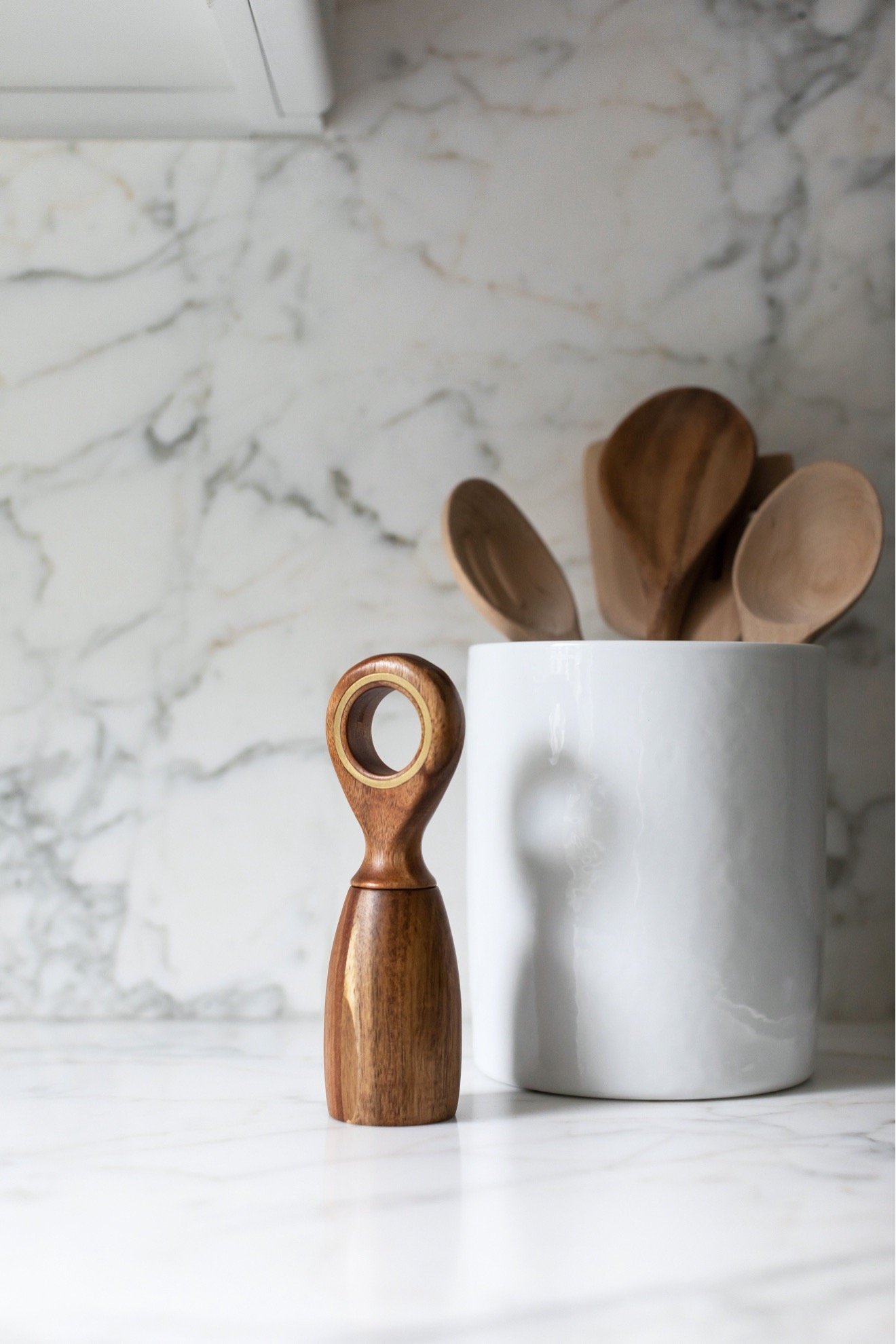
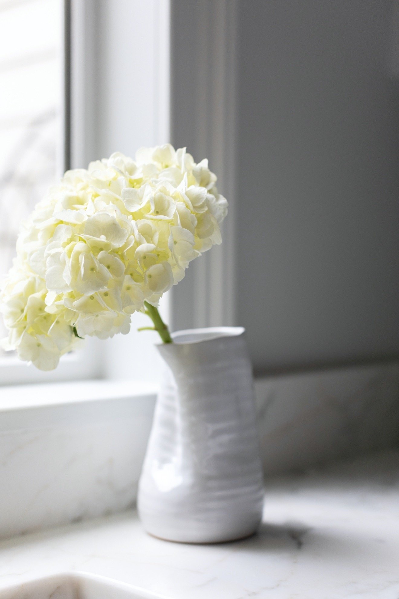
There are lots of details that make this kitchen special. Here are some more pics of those:
- Comments
Leave a Reply Cancel reply
Morse Design is a premier interior design firm known for superior service and interiors that blend timeless sophistication and livable luxury—crafted exclusively for tenacious and tasteful homeowners who want to host, relax, and thrive in a space that feels distinctly their own.
back to the top >




+ Comments