How to Create a Warm Kitchen-Enclave Circle Kitchen Reno – Part 1
inspiration
design tips
press features
project reveals
search the blog
Hey there! I’m Andi, owner and lead designer. At Morse Design, we’re committed to creating luxury homes that are perfectly tailored to you and your family’s daily living. With years of experience and a love for beautiful, functional interiors, Morse Design is where exceptional meets the everyday.
Morse Design
Welcome to
Kitchens are truly the heart of the home. So much of life happens in here. Cooking, entertaining, and hanging out. More times than not, a kitchen is connected to the family room. Whether it’s an open concept plan or the neighboring room, the kitchen is intertwined with family living, day to day. Having a highly functionable kitchen as well as a beautiful one is our ultimate goal at Morse Design.
When working on a kitchen renovation one of the first items we take care of is selecting the kitchen appliances. I tell clients to make a wish list of every appliance they would like to have in their dream kitchen. They may not be able to get every one based on space and pricing, but we want to know the options available before ruling anything out. We go to a showroom that has most every brand and type of appliance on site. Clients get to touch and feel every option as well as know general pricing before making final selections.
This kitchen was totally gutted. We took our time in planning this one out. After knowing the clients appliance wish list, we worked with a kitchen designer, Catherine Cullens, to have her help with the initial kitchen layout, only. We wanted to keep all of the original walls other than the weird angle of the stove location. Here’s a picture of the main kitchen area before we got our hands on it:
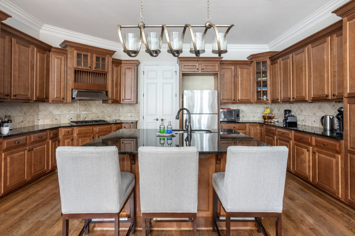
As you can see in the main part of the kitchen there was an angle where the stove was located. The ultimate goal was to straighten out that angle making more room for cabinetry.
Next to the main kitchen area there is a side bar where the dining table is located.

We liked the location just not the setup of the cabinets. (We’ll talk about this area in the next blog post.)
We worked very methodically when designing this kitchen. We took into account every piece of equipment that would be housed in here including cookware, dishes, and small appliances. We spent a couple of days with lots of sticky notes planning out where everything would be located. Going through this exercise gave the clients alot of confidence in their decision making regarding the plans.
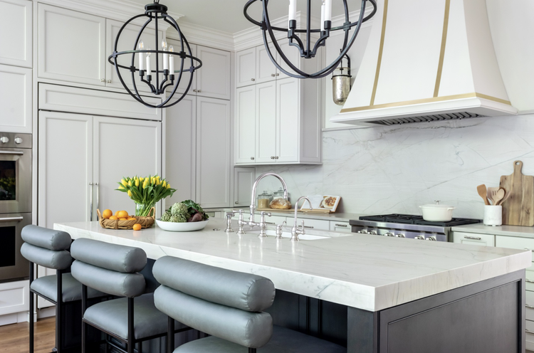
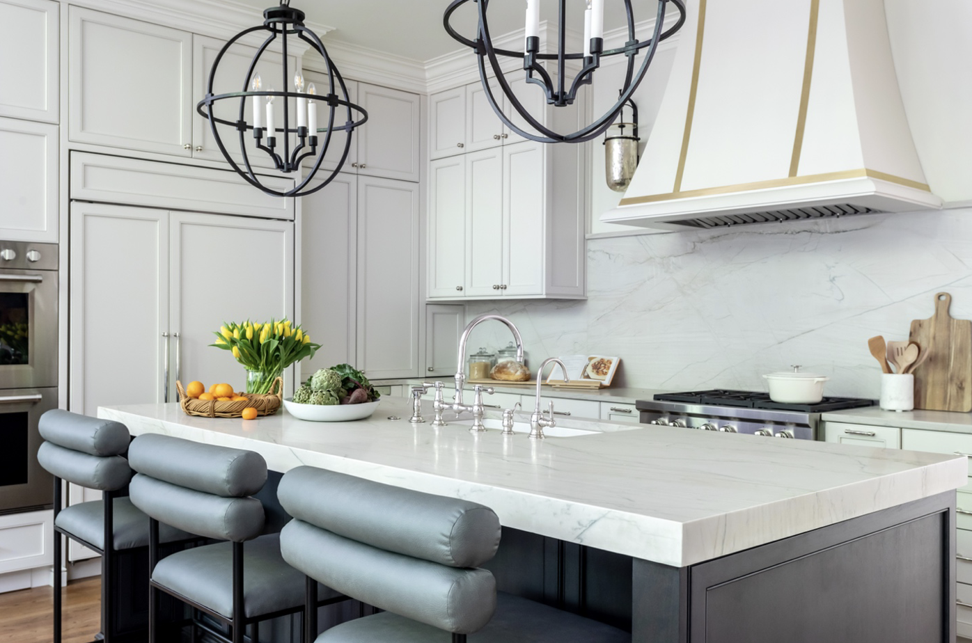
Our clients wanted a light and bright kitchen. At the same time they also wanted there to be a contrast. We decided to use a different finish on the island and tied that into the bar cabinets. We choose a soft white for the surround cabinets and a dark stain for the island and bar. Even though the island and bar are dark, the surround cabinets and all of the lighting create a very light and airy space.
Here is the finished kitchen:
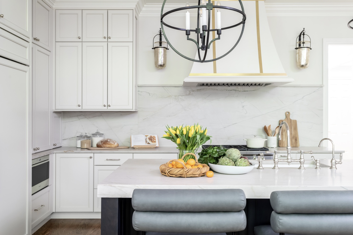
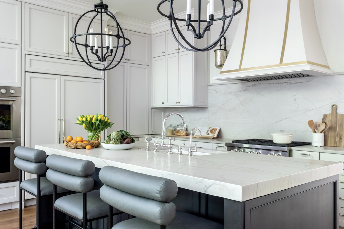
As you can see the angle is gone and we were able to create an appliance wall. We put as many of the appliances together to make using them more efficient and productive. The clients can go from the refrigerator directly to the ovens on the left side and to the microwave on the right.

We moved the entry point to the formal dining room from the center of the kitchen to the far right creating another long wall to create a spectacular hood moment.

The hood was an important feature for us to incorporate into the kitchen. The one we landed on is created from painted wood with brass strips. It is a highlight of the space.


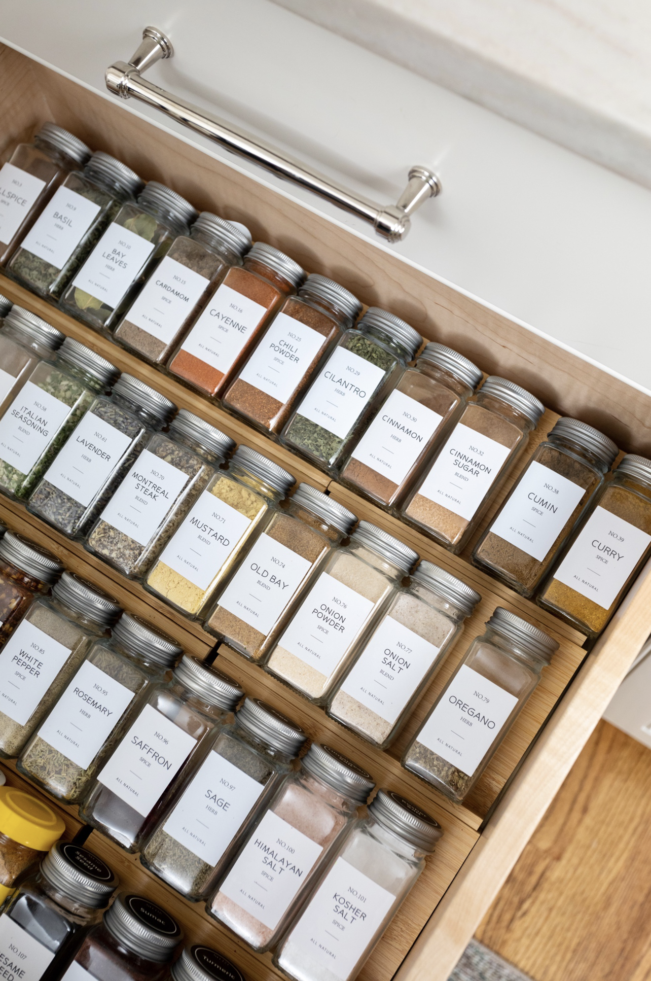
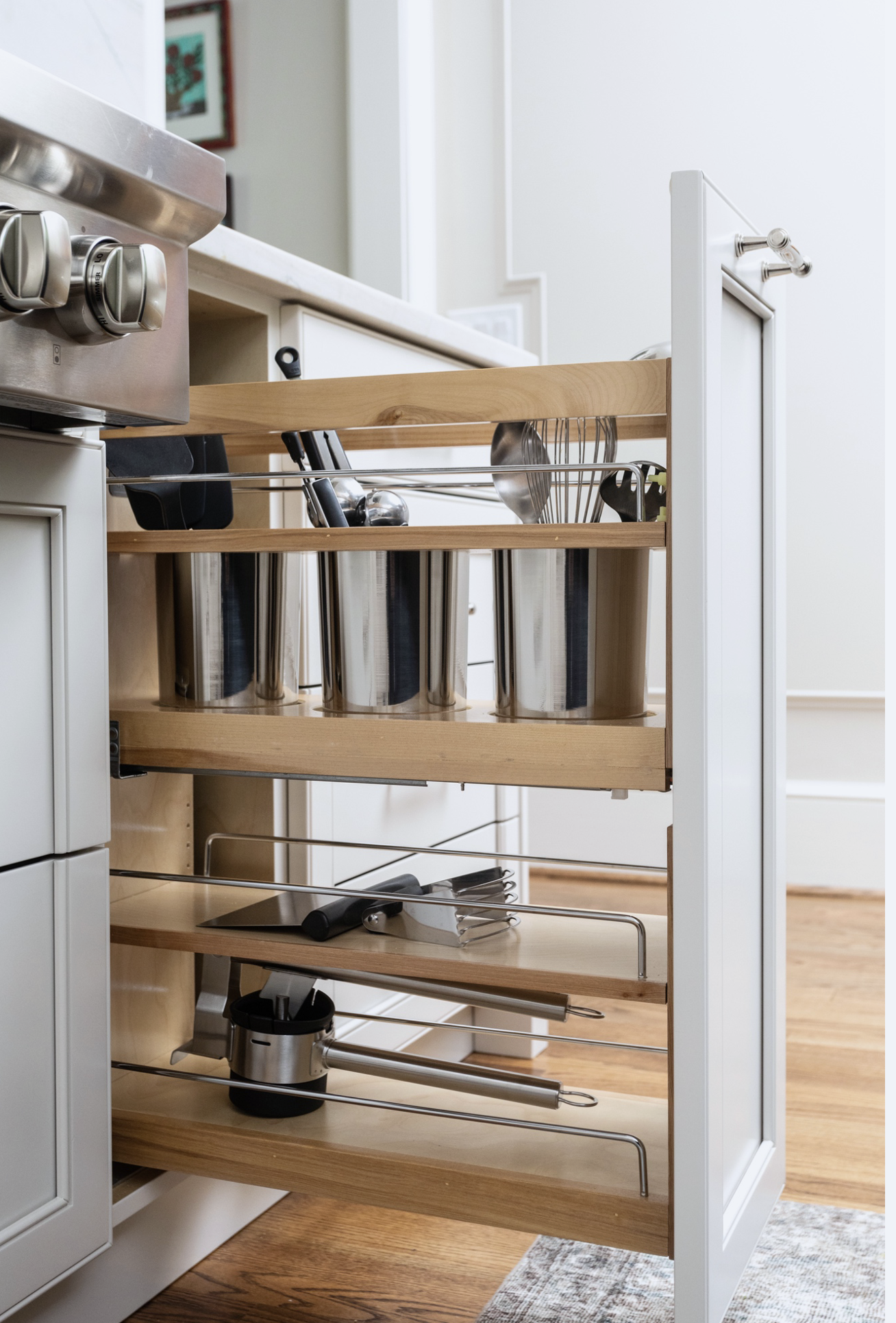
For this client organization was of extreme importance. We made sure to have many of the drawers outfitted to accommodate order.
A spice drawer…
Drawers specifically made for silverware and sharp knives…


A place for cooking trays above the ovens…

We had pull outs created for cooking utensils…
The ultimate splurge was creating a cabinet with a lift for the mixer. No more having to move a heavy piece of equipment to make those cakes and cookies. It’s just a simple lift and it becomes very convenient.
Here you see it…

Now you don’t…

Instead of going with a typical backsplash we used the quartzite that was on the counters for the backsplash. Quartzite is a great substance that is beautiful and shows movement. It’s not as soft as marble, but still has a natural made quality to it. We also made the countertop on the island look thicker by mitering the edges.
Sourcing the polished nickel faucet gave an elegance to the entire island.
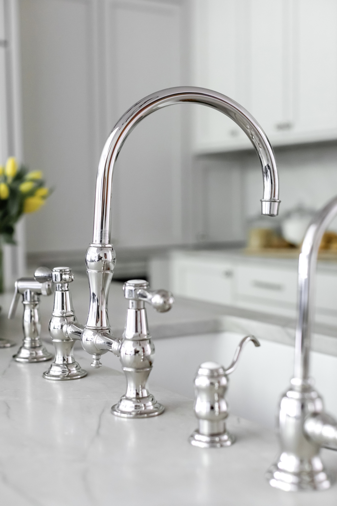
We mixed different finishes in this kitchen. Black iron for lighting, polished nickel for faucets and hardware and some brass details on the hood. It came together beautifully.
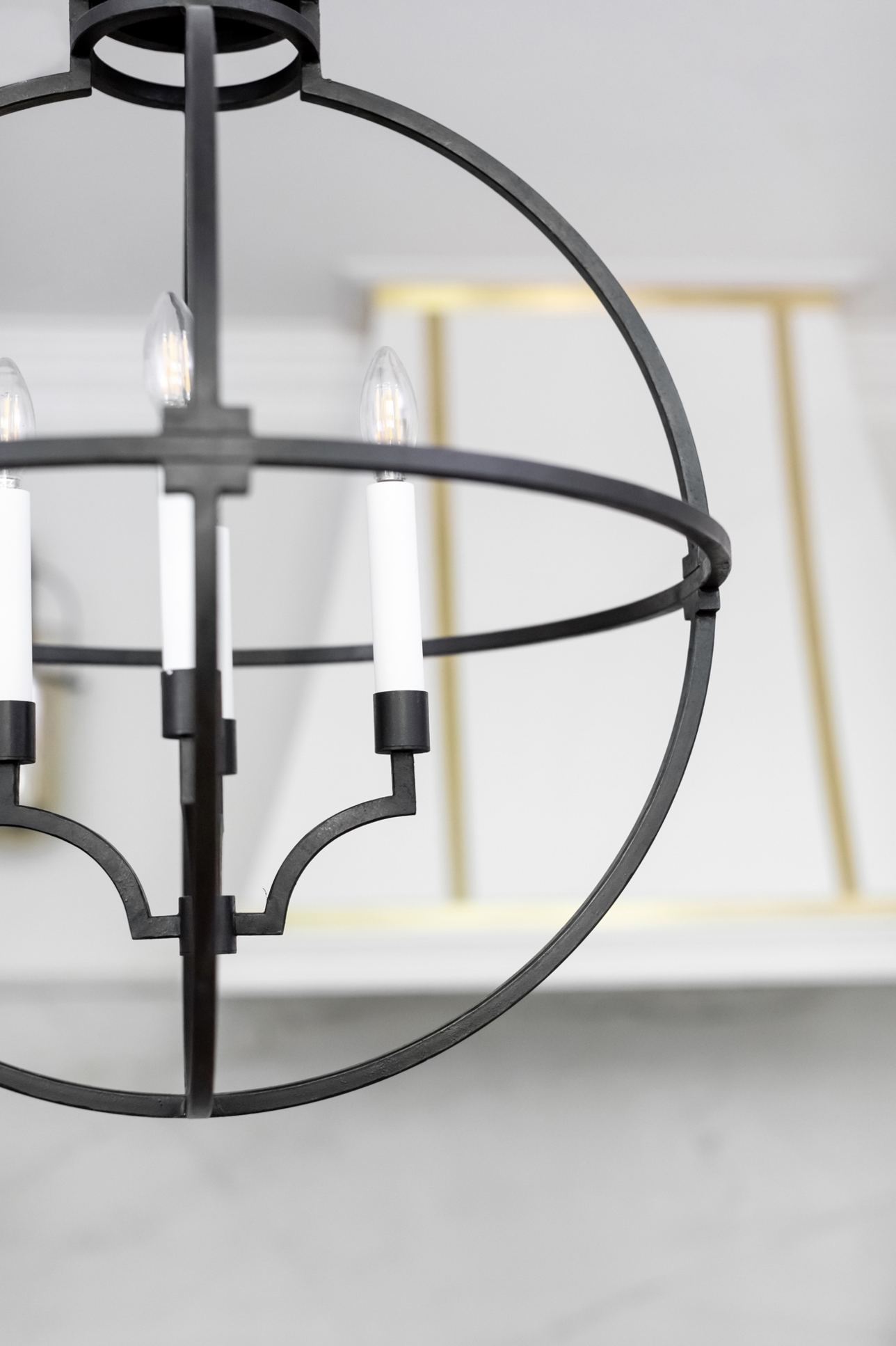
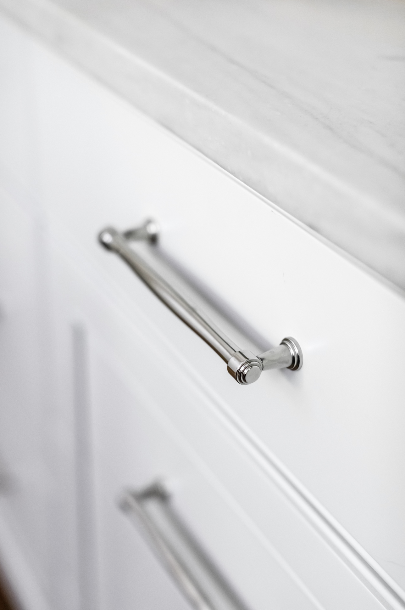
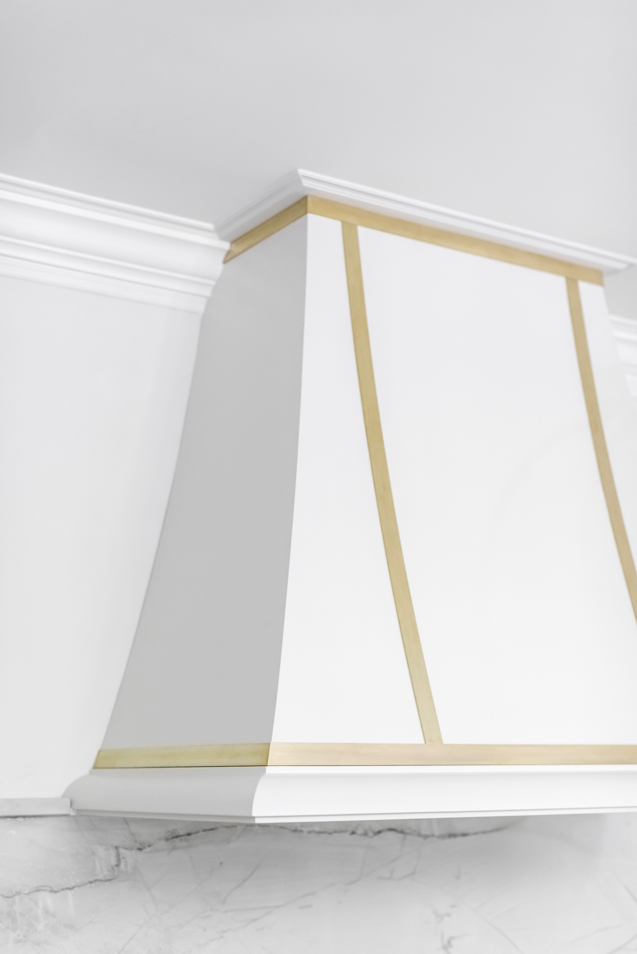
Mixing it up added more interest to the space than having everything match.
The finishing touch to the space was ordering these custom stools from Bradley, USA . Not only do they look great, but they are super comfortable. They are made from a faux leather so they wear really well and are wipeable. It’s pretty impossible to destroy them. They’re ready for anything!

Stay tuned for next week’s post about the Bar Area of this home! You’ll find out how we tied it all together.
- Comments
Leave a Reply Cancel reply
Morse Design is a premier interior design firm known for superior service and interiors that blend timeless sophistication and livable luxury—crafted exclusively for tenacious and tasteful homeowners who want to host, relax, and thrive in a space that feels distinctly their own.
back to the top >
+ Comments