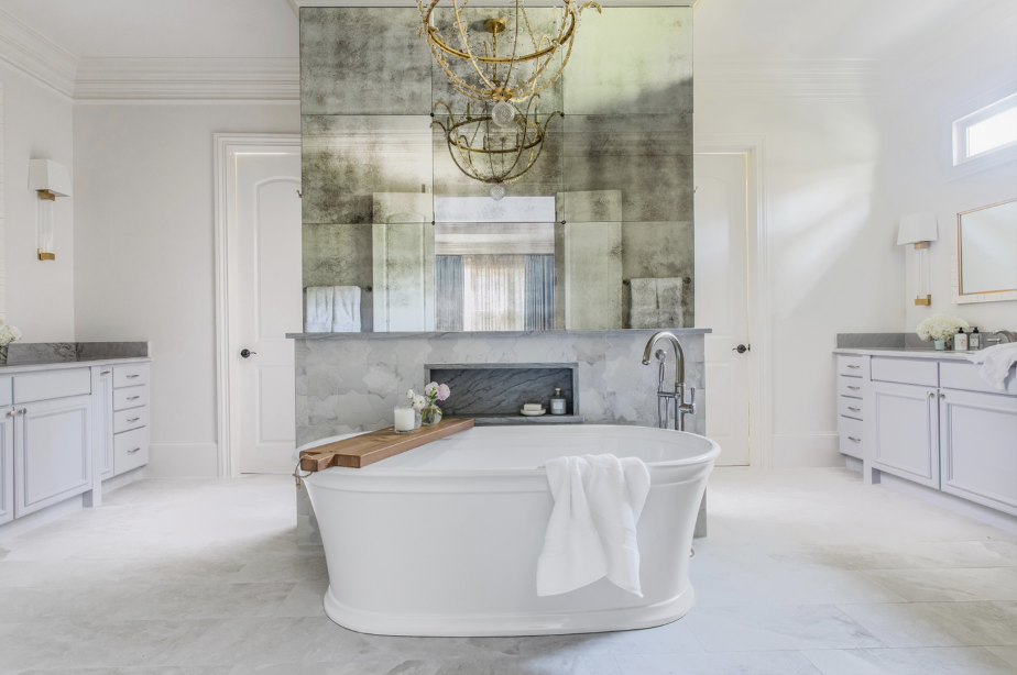
Marietta Bathroom Renovation: Blending Classic Elements with Modern Design
inspiration
design tips
press features
project reveals
search the blog
Hey there! I’m Andi, owner and lead designer. At Morse Design, we’re committed to creating luxury homes that are perfectly tailored to you and your family’s daily living. With years of experience and a love for beautiful, functional interiors, Morse Design is where exceptional meets the everyday.
Morse Design
Welcome to
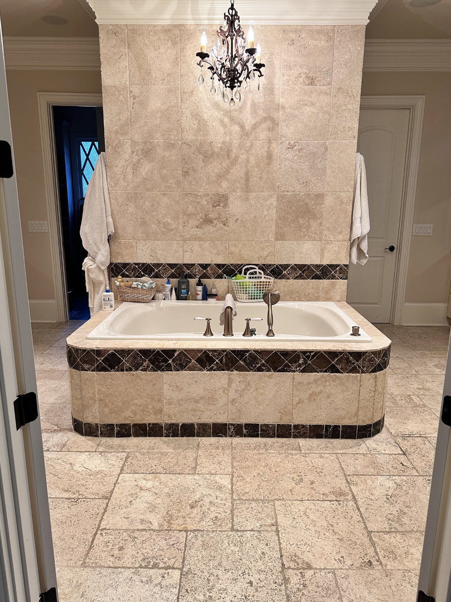
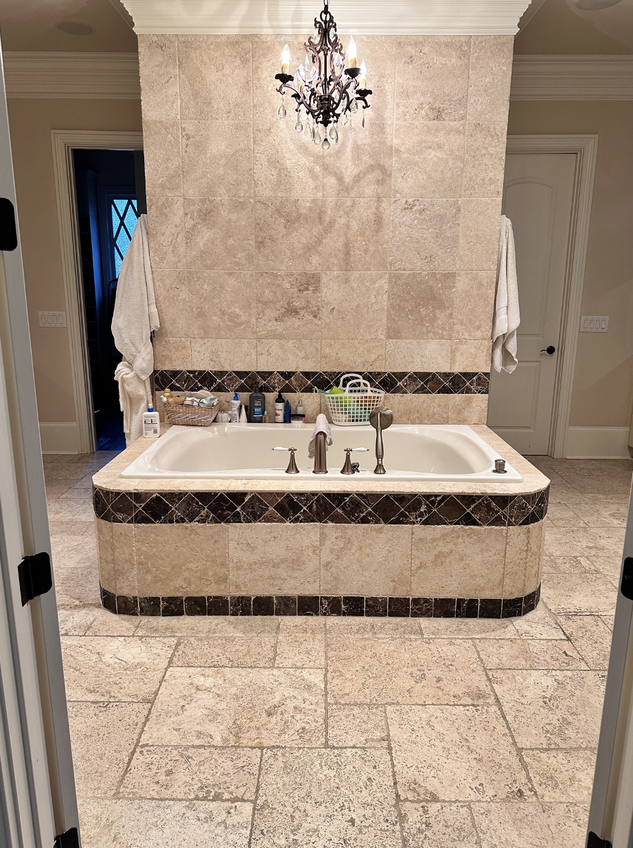
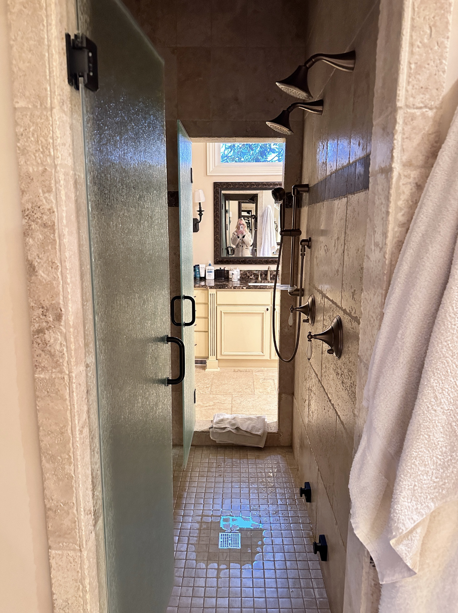
Our Marietta Bathroom Renovation Project turned out beyond our expectations. It illustrates that you can create a beautiful space without replacing everything. Don’t get me wrong, we did change most of it, but the one item we left were the vanities. It was a way to save on the cost as well as knowing a little paint would make all the difference in the world. Here is how the bathroom looked BEFORE we started.
The bathroom was very dated. It was the same bathroom from when the house was purchased over a decade ago. The bathroom is very large and allowed us to use substantial pieces. It’s hard to tell from the pics, but the vanities were in good shape. Their design was a bit dated and heavy, but we knew with a bit of paint and new counters, the vanities would look totally different and would fit into our design plans.
After our initial consultation we got right to work coming up with a plan that would lighten up the space, but still be warm and welcoming. One of the first decisions was to get rid of the huge tub. It took up too much space and at this point wasn’t functioning well. We knew a stand-alone tub would be beautiful and timeless ,as well as function well for the long term.
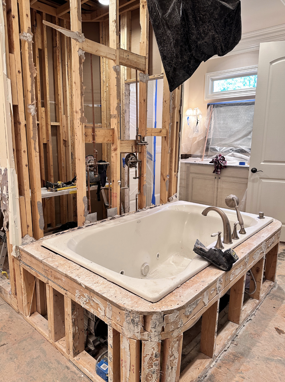
(Celebration dance happening as this was being removed!)
The next step was to take our clients to select tiles. It can be overwhelming to look at all of the choices, but with us there, we were able to limit the selections and help our clients stay focused. Here is what we picked out.
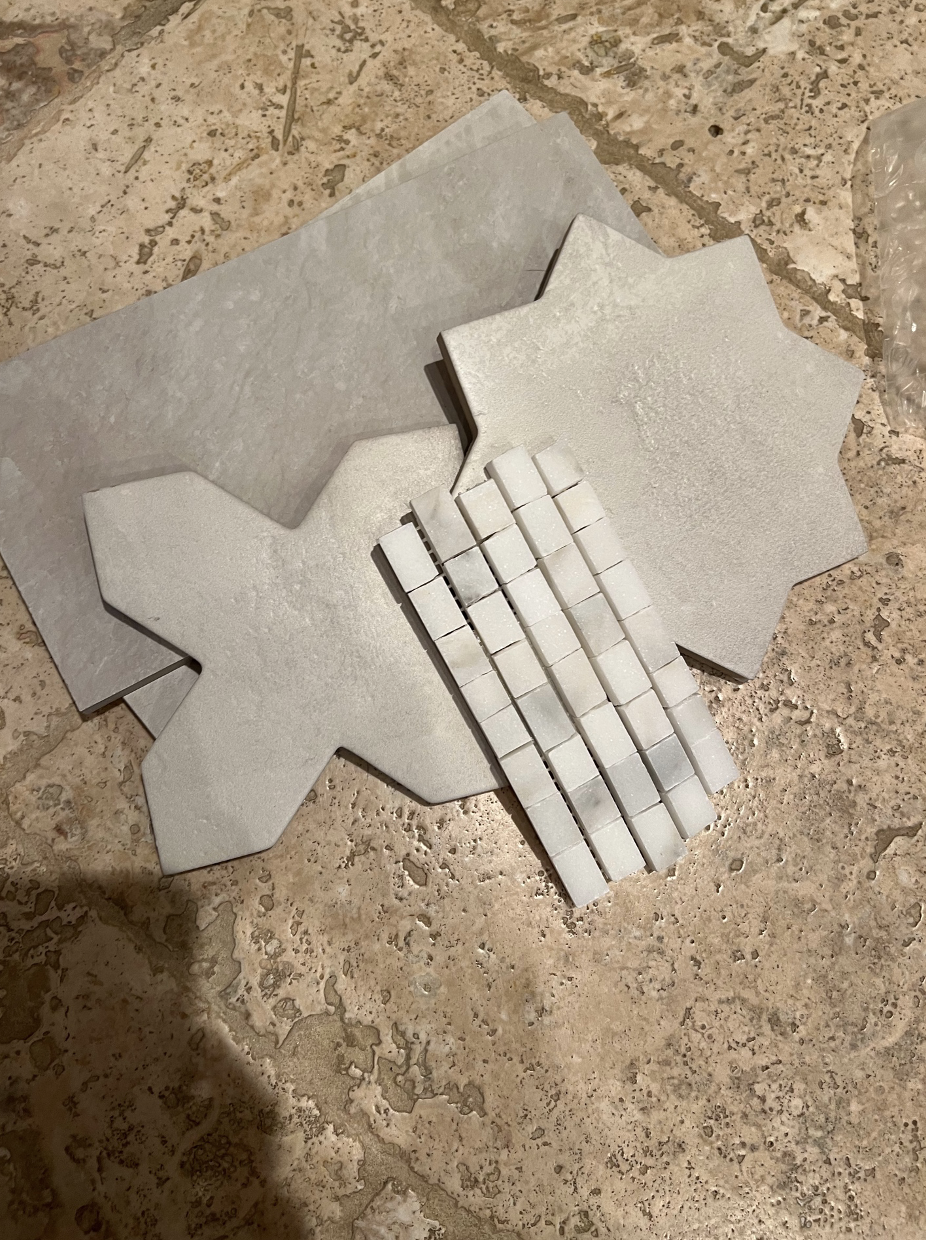
The tile combination was much lighter than what was previously in the bathroom and it also had a bit of fun to it with the “star and x “tile combination.
Once we selected the tile we picked the paint colors. I like to have paint selections determined before selecting counters. This way we can take paint samples and tiles with us to the slab yard to get a real vision of everything working together.

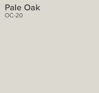
We used BM Silver Satin for the vanities (above left). And BM Pale Oak for the walls and trim (above right). As you can see painting the vanities changed their look. Here is the BEFORE:
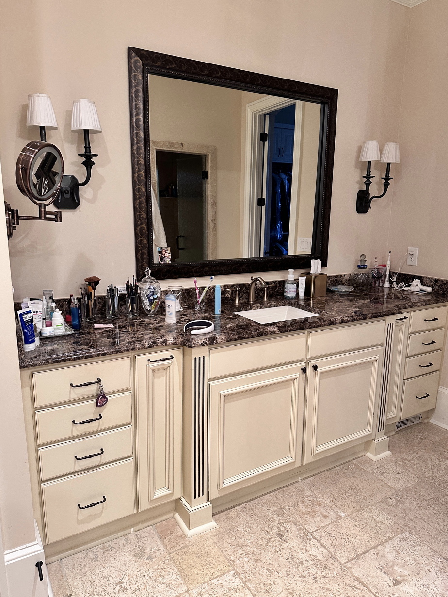
And now look at the AFTER:
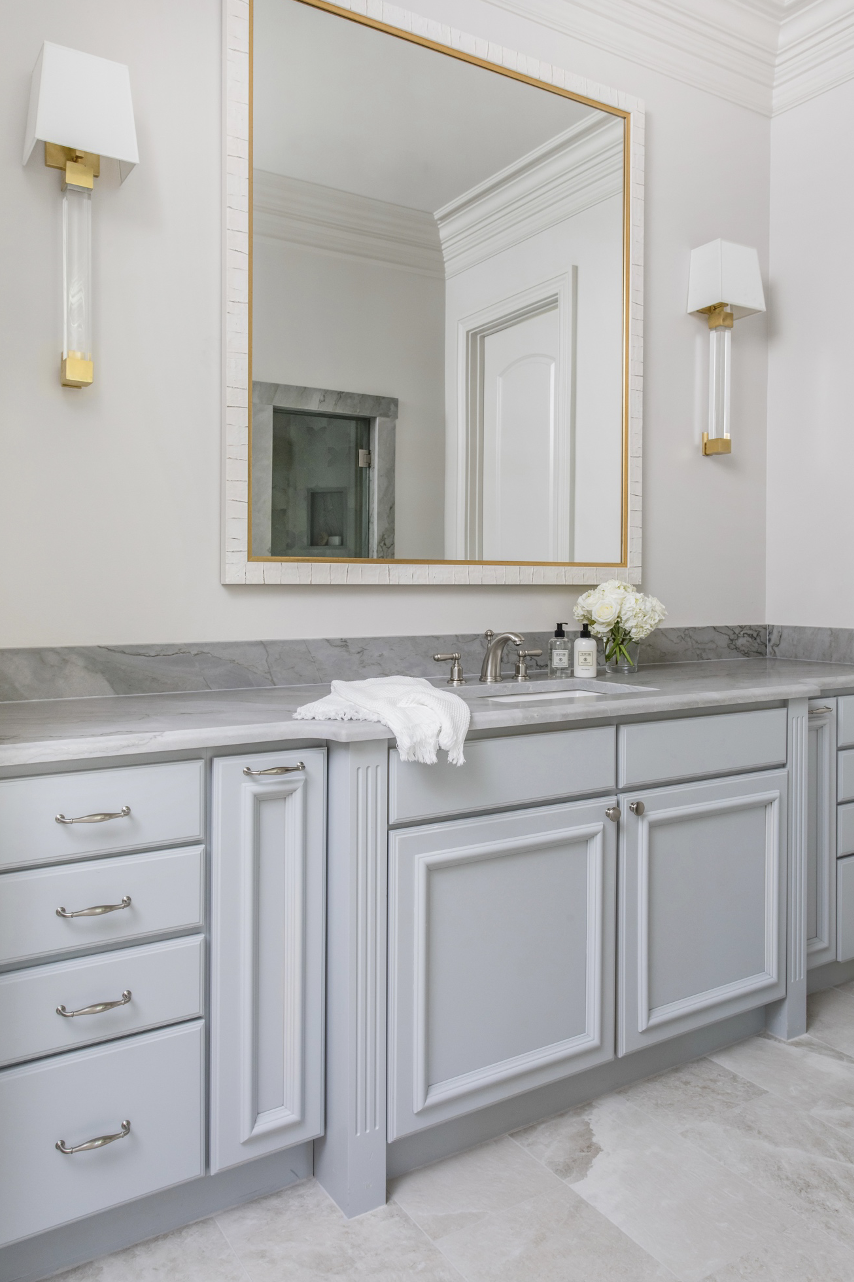
The newly painted walls also helped to lighten up the entire space. There is little natural light so we needed the paint to work overtime.
Here is the other vanity BEFORE:
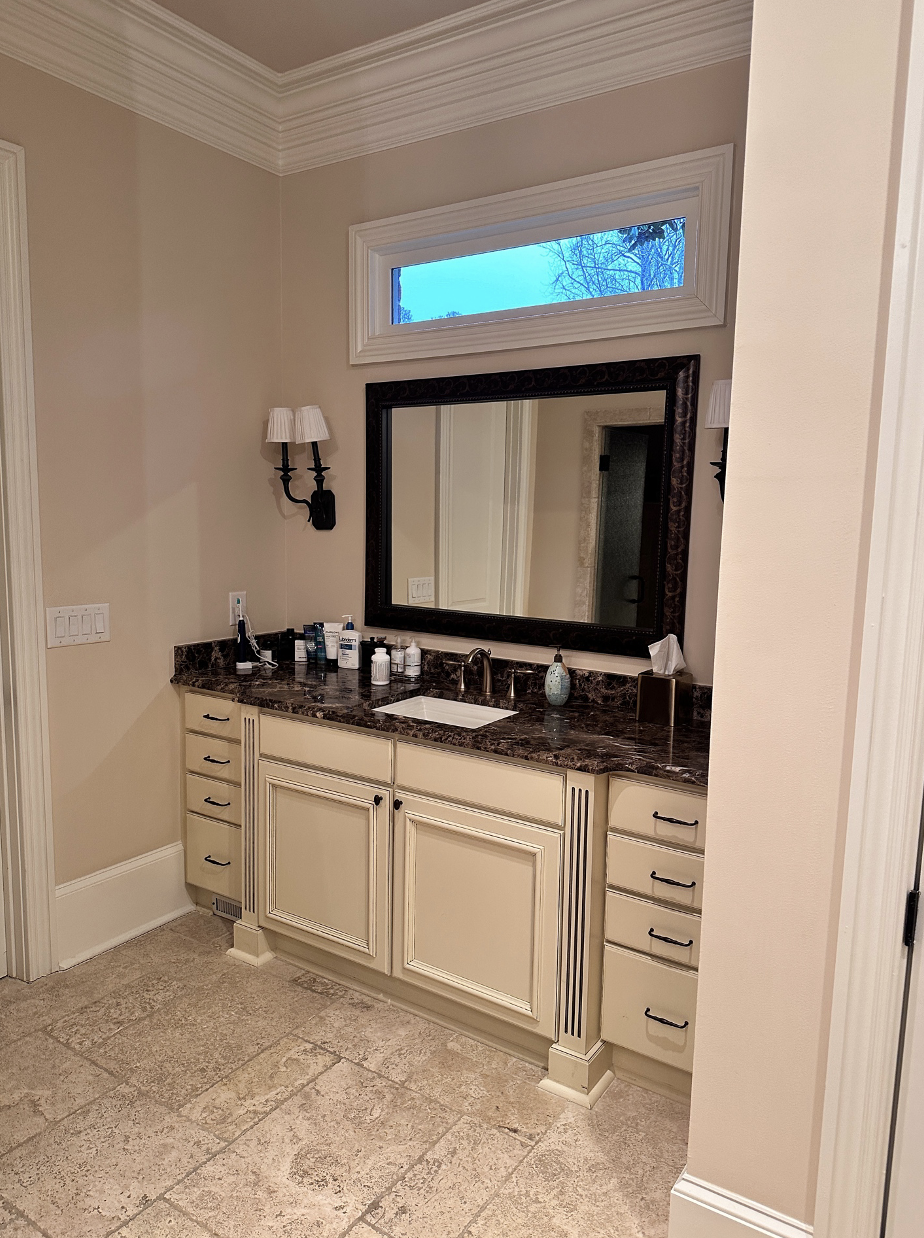
And now, the AFTER:
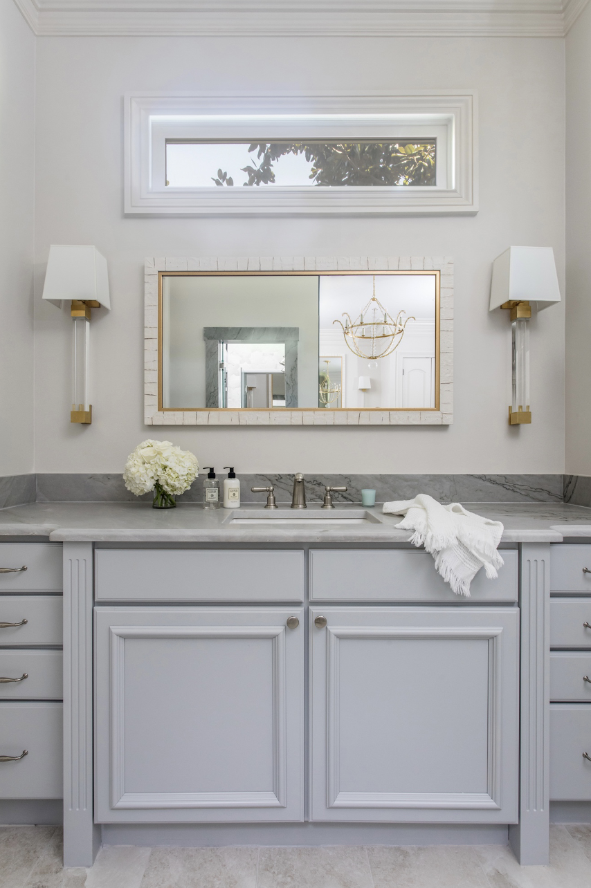
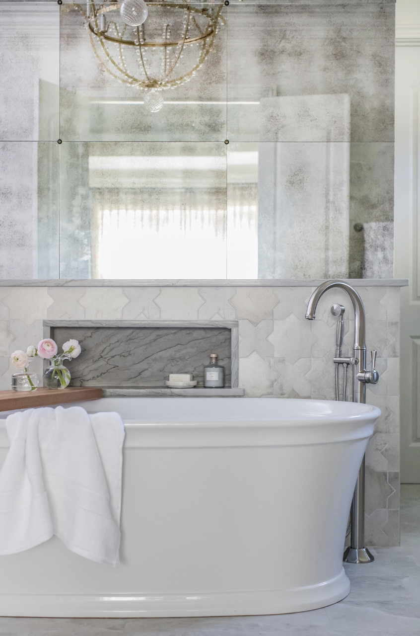
We really wanted to create a “moment” in the bathroom. We found the perfect locatin at the entry to the room. There was plenty of space with double doors. It was the perfect place for the gorgeous tub and filler. We created a backdrop by tiling halfway up the wall behind the tub,
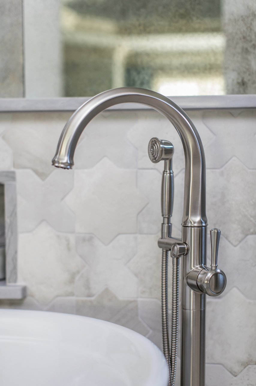
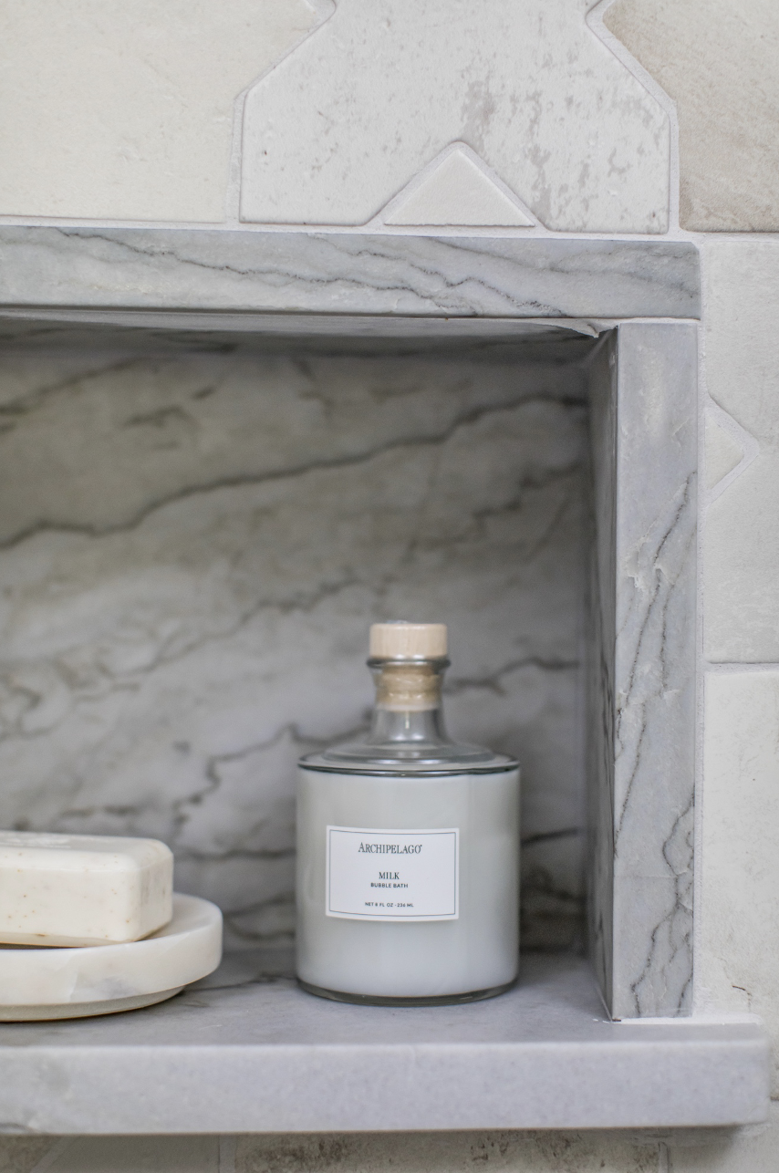
and using quartzite as a running edge on the top. We also used the same quartzite in all of the niches. It adds so much beauty to the space.
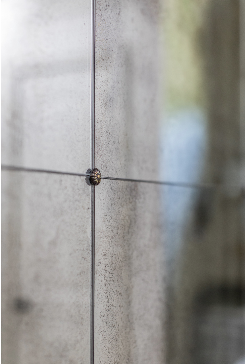
Above the stone we installed antiqued mirror panels with small gold florets.
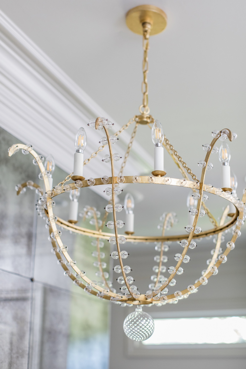
The end result is absolutely stunning. Adding the gorgeous Visual Comfort light was the icing on the cake.
We went from this BEFORE:
To this AFTER:

I mean, the new set up is beyond impactful! It screams GORGEOUS!
My client loved the stair and X tile. We wanted to use it as much as possible. We installed it on the shower walls,
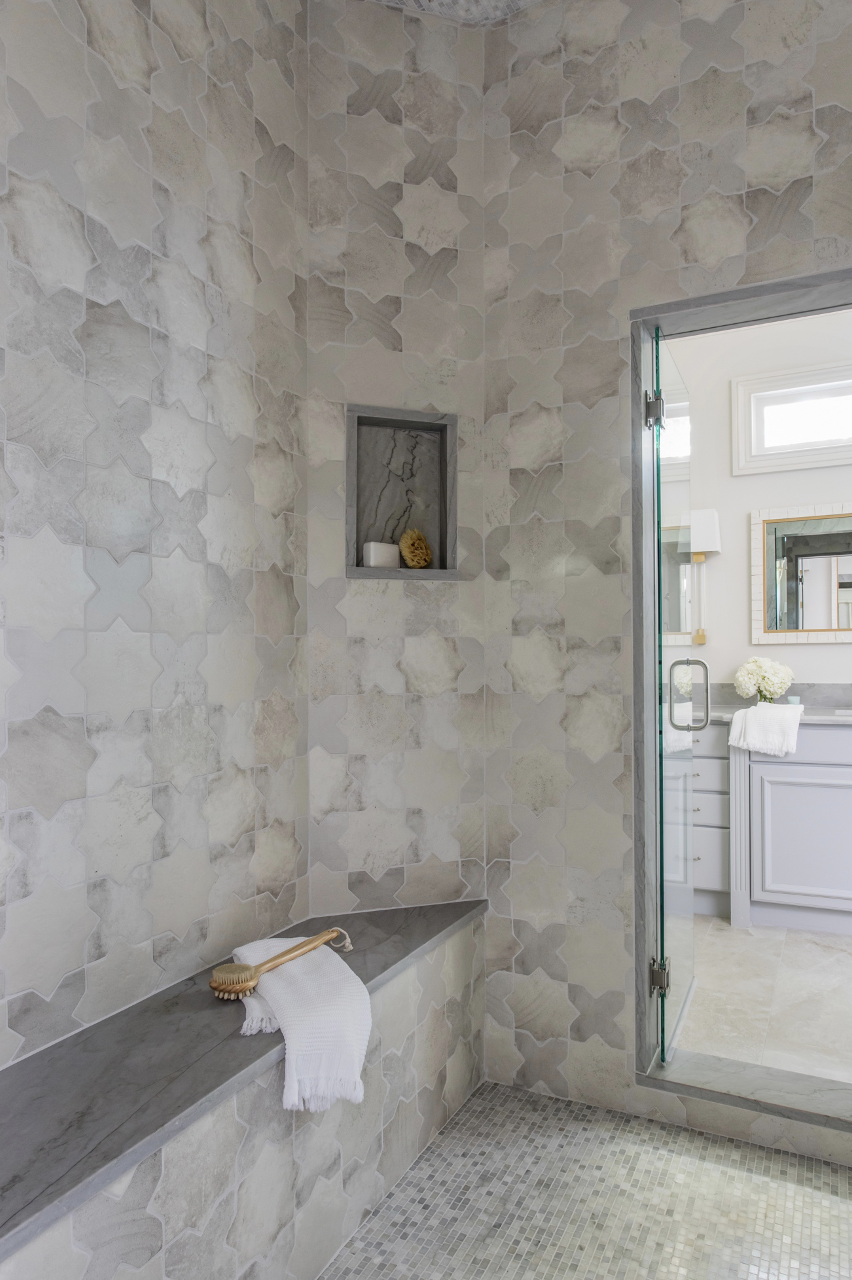
and again used the quartzite for all of the niches and topped off the bench.
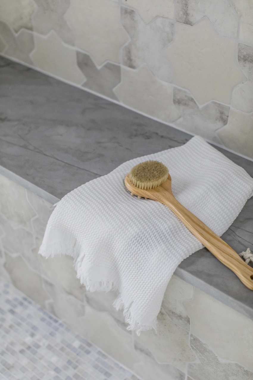
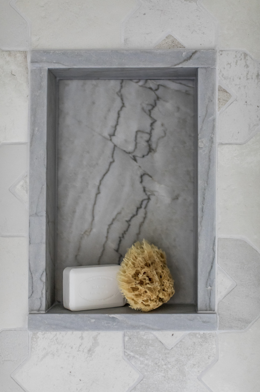
We used a beautiful marble tile mosaic on the floor and ceiling of the shower with quartzite tracing the entry point on both sides.
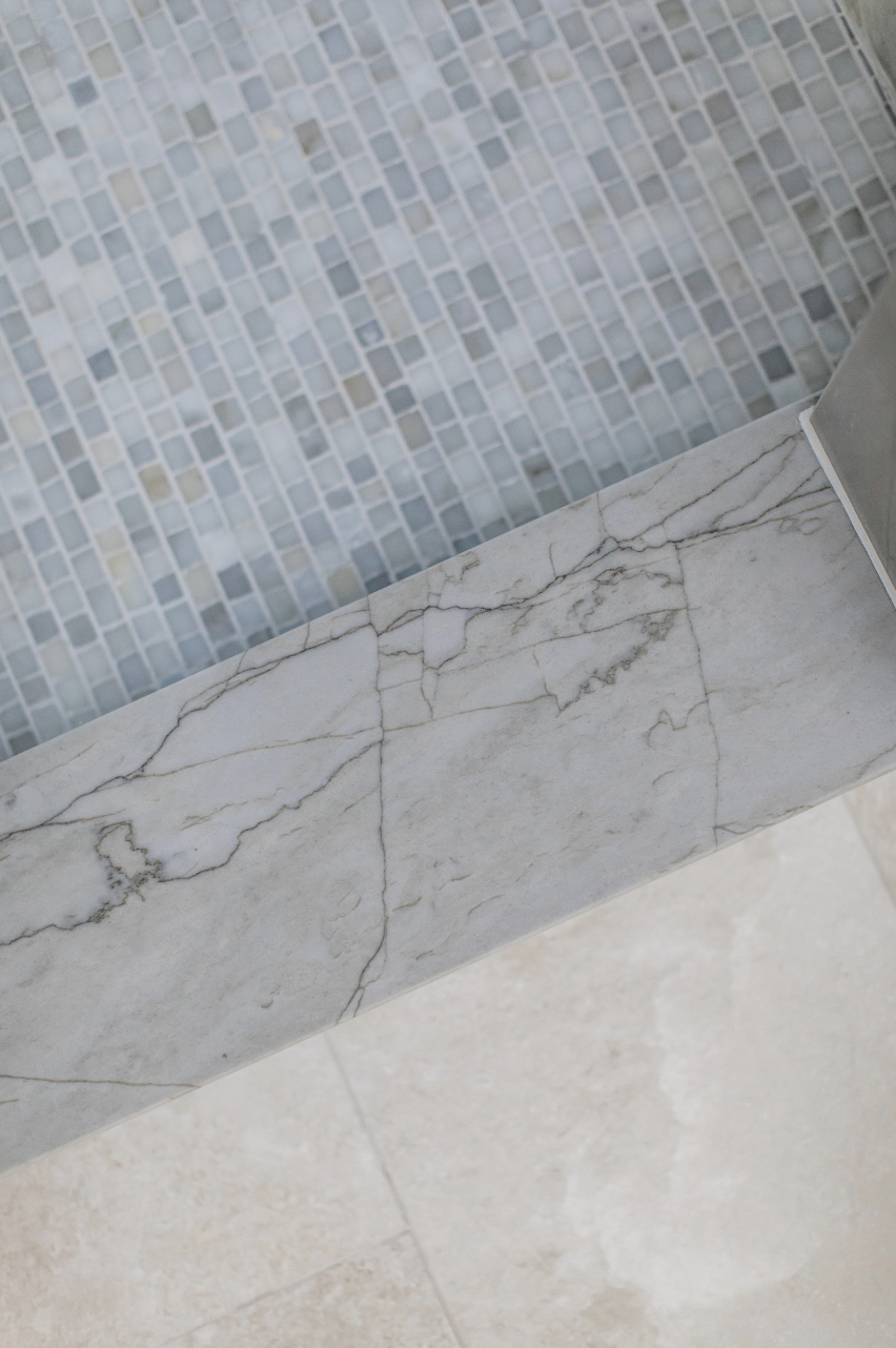

All of the details came together beautifully creating a sophisticated, lighter and airy primary bathroom.
+ Comments
- Comments
Leave a Reply Cancel reply
Morse Design is a premier interior design firm known for superior service and interiors that blend timeless sophistication and livable luxury—crafted exclusively for tenacious and tasteful homeowners who want to host, relax, and thrive in a space that feels distinctly their own.
back to the top >


Thank you for creating such valuable content. Your hard work and dedication are appreciated by so many.
“A fantastic contribution to an ongoing discussion! I’ve shared some of my own research—let’s exchange thoughts!”
This article is incredibly insightful! It’s crucial to consider perspectives like this when making informed decisions. I’ve also explored similar topics on my website—feel free to check it out.