Sandy Springs Renovation Reveal, Part 2: Powder Bath, Mudroom and Dining Room
inspiration
design tips
press features
project reveals
search the blog
Hey there! I’m Andi, owner and lead designer. At Morse Design, we’re committed to creating luxury homes that are perfectly tailored to you and your family’s daily living. With years of experience and a love for beautiful, functional interiors, Morse Design is where exceptional meets the everyday.
Morse Design
Welcome to
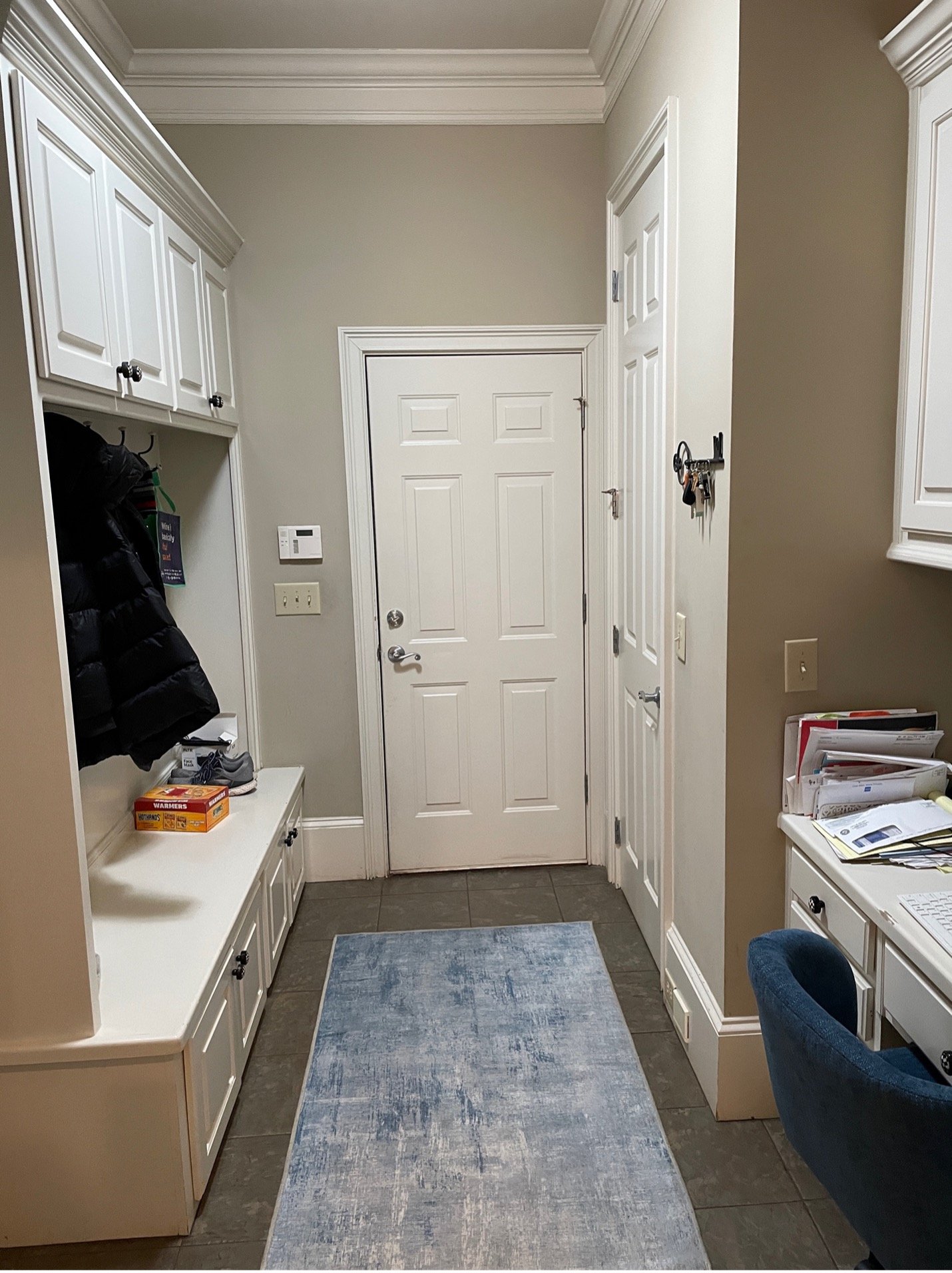
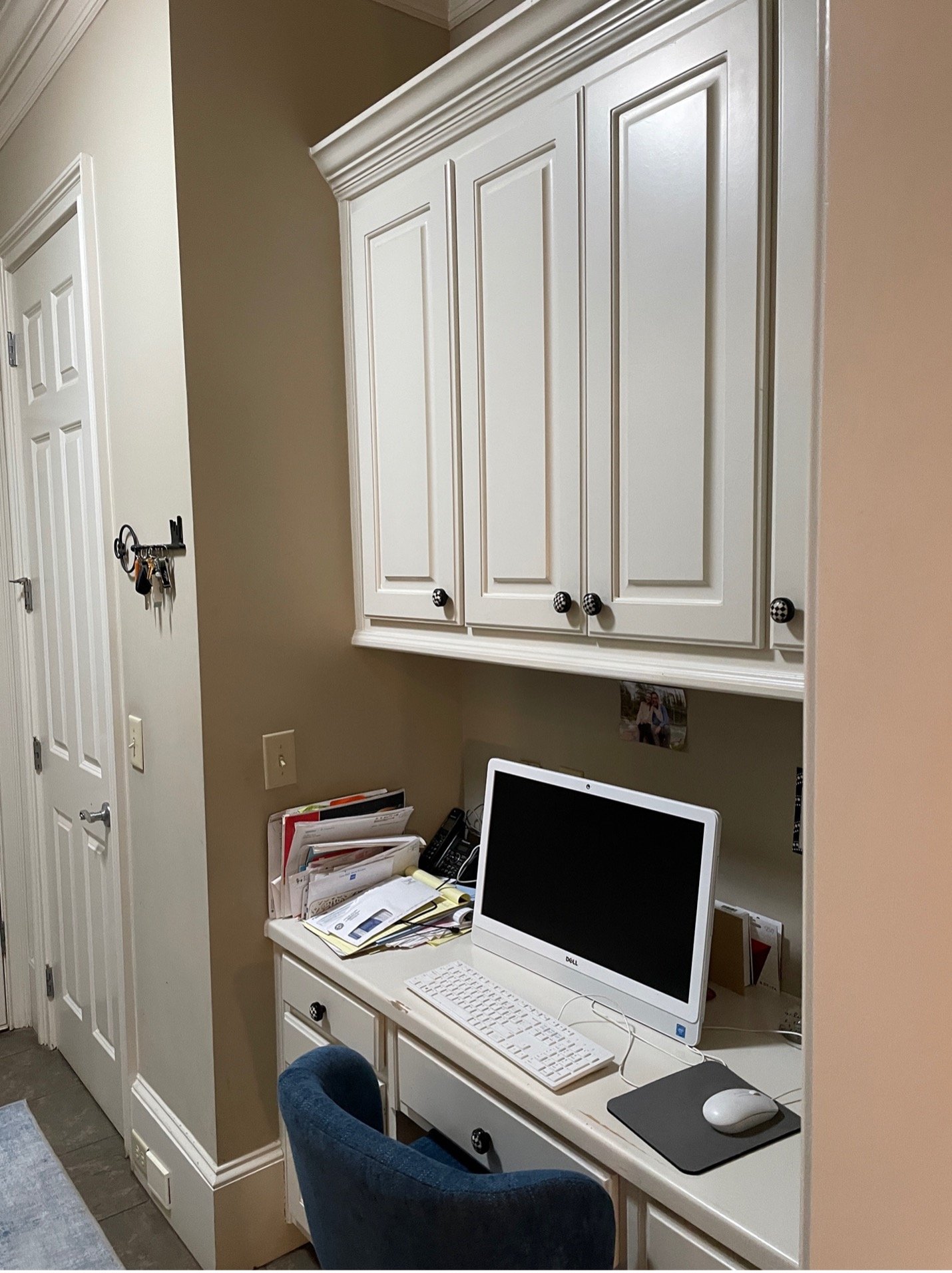
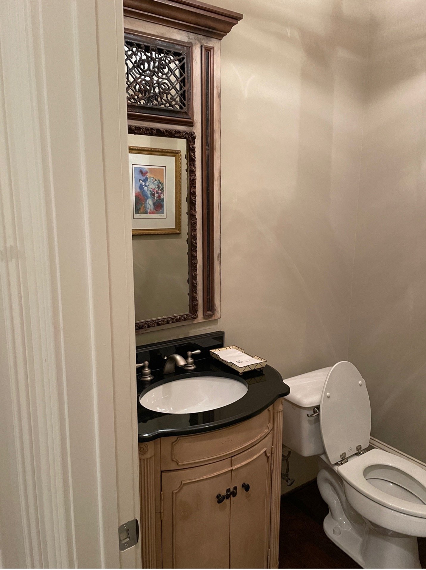
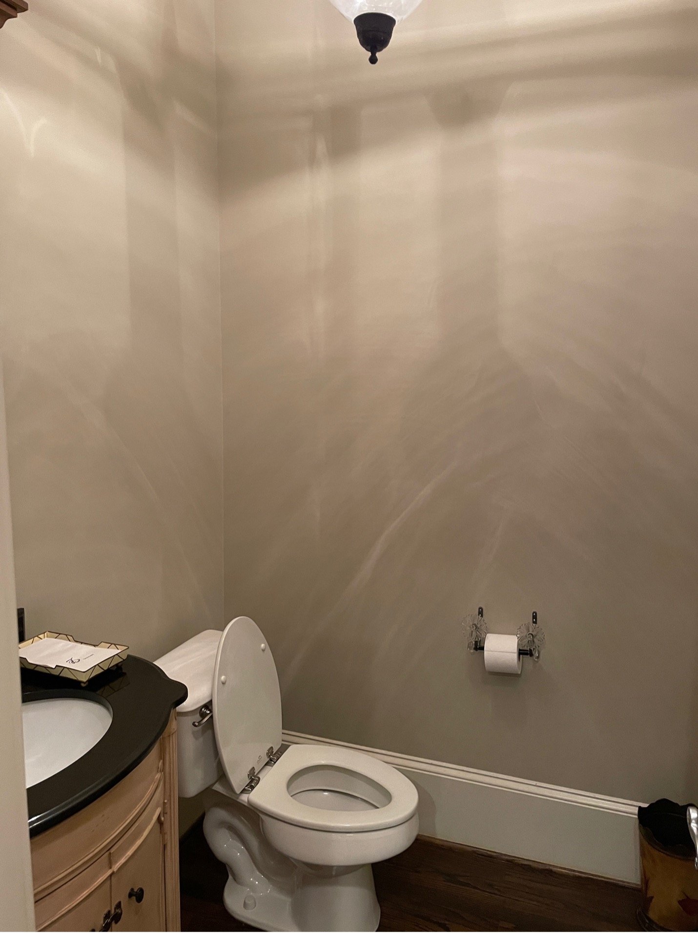
By now, you have hopefully read the first blog post about the renovation of this home that covered the kitchen, breakfast area, and family room. If not, you can catch up here. We are continuing the project in this post about the mudroom, powder bath, and dining room. We always love some good before and after photos. To get started this is what the areas looked like when we began:
The mudroom:
The powder bath:
The dining room:

The homeowners wanted to jazz up the mudroom, but didn’t want to put a ton of money into it. We decided to leave the tile since the entry from the garage was right there. We felt with people tracking in the tile would hold up better. So we left the original tile and simply painted the cabinets the same blue we had chosen for the kitchen island and family room built-ins. It completely changed the entire look of the area. We even used the same knobs. Here is how it looked when we were finished:
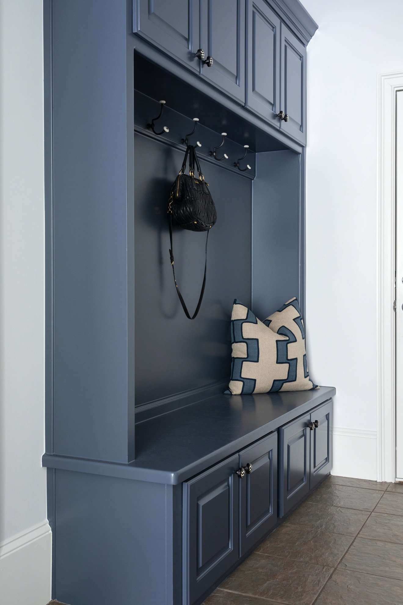

The blue brought this entire area to life. It now is a fun little entry space.
For the powder bath, the existing vanity was the perfect size and had storage which is not easy to find. The homeowners liked the look of it and were on board to leave it and paint it. First, we found a beautiful wallpaper for the small space. We kept the blue theme going that was being carried through the rest of the home and settled on this one:
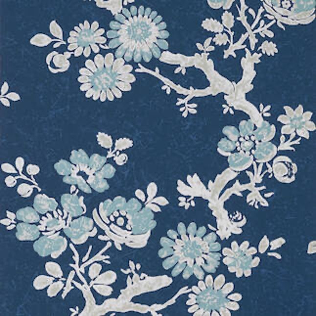
It’s a feminine paper that had some pretty blue colors and was a bold choice to liven up the bathroom. We found a blue paint color that coordinated well with the paper to paint the vanity.
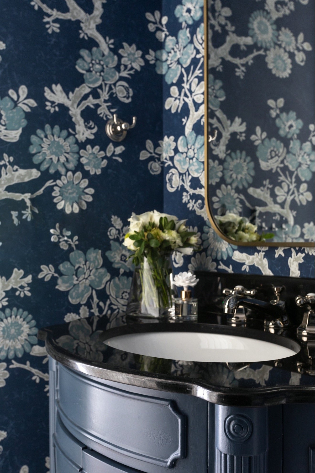
The original black counter worked great with the paint selection.
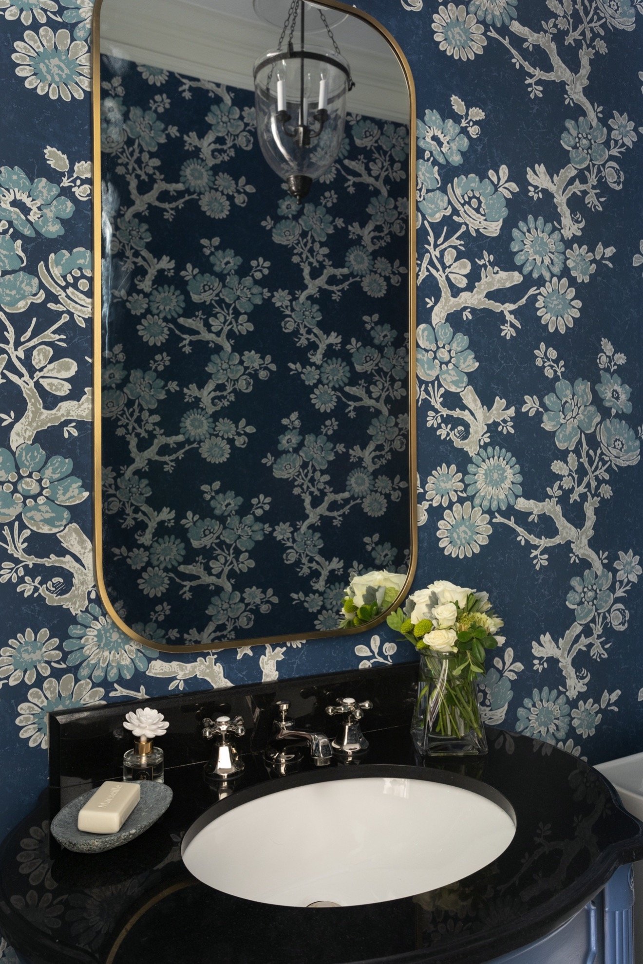
We changed the faucet to a pretty polished nickel and added a wall sconce and mirror.
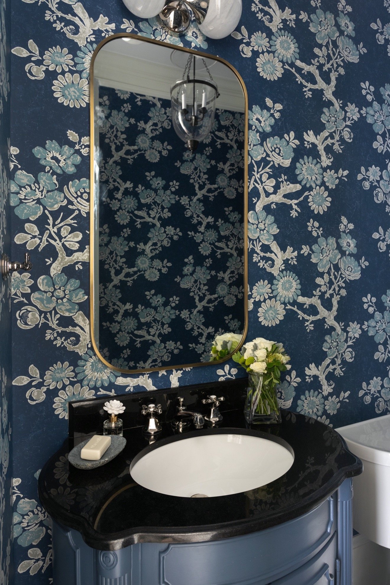
It turned into a little jewel box.
The last space on this floor was the dining room. It’s a nice size space but had no pizazz. They were keeping their current furniture and just wanted to “wake” it up. We picked a beautiful blue-green paint color and painted the walls above the moldings. The color coordinated well with the blues we had been using throughout the rest of the home. We went from this:
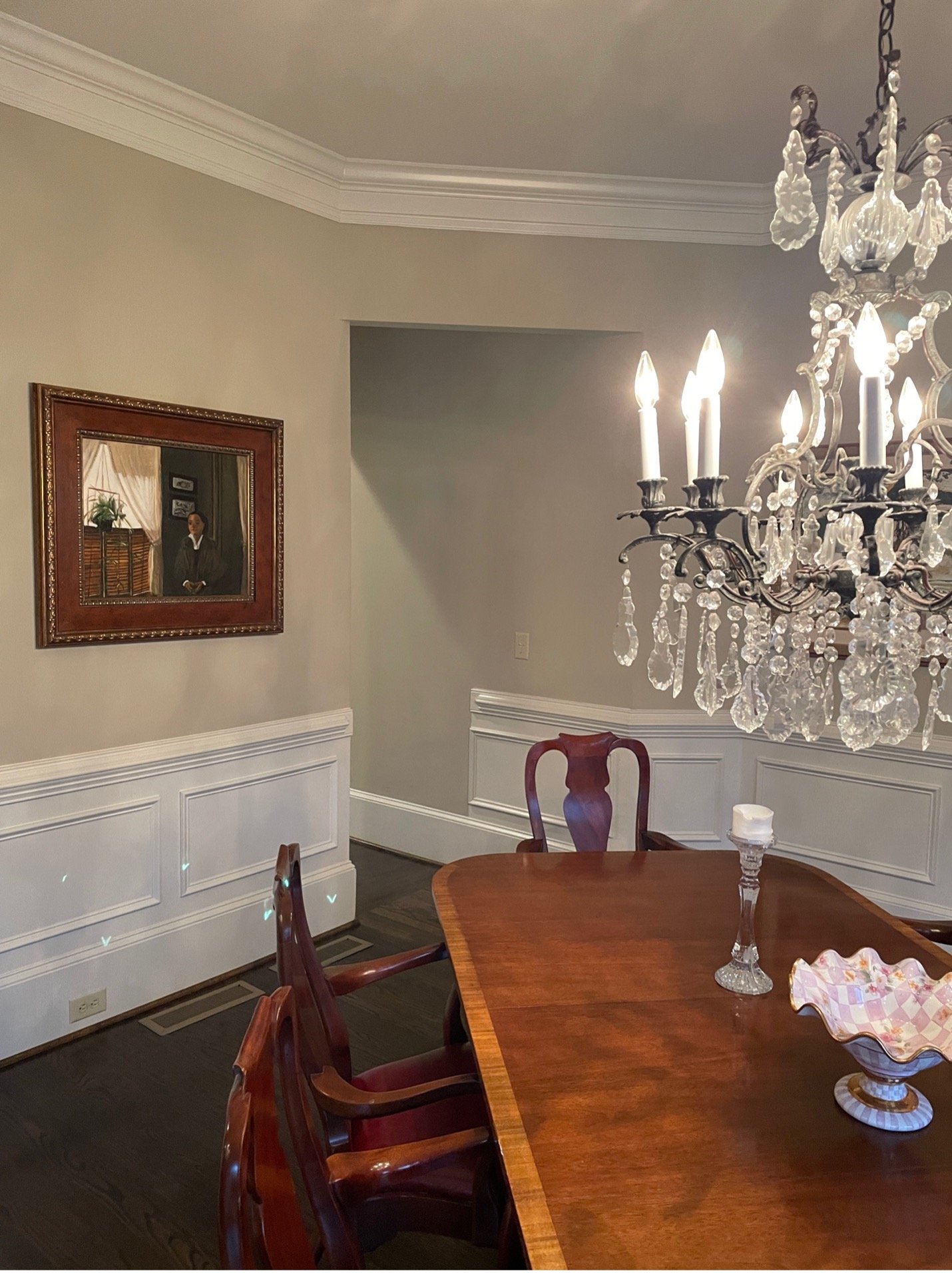
To this:
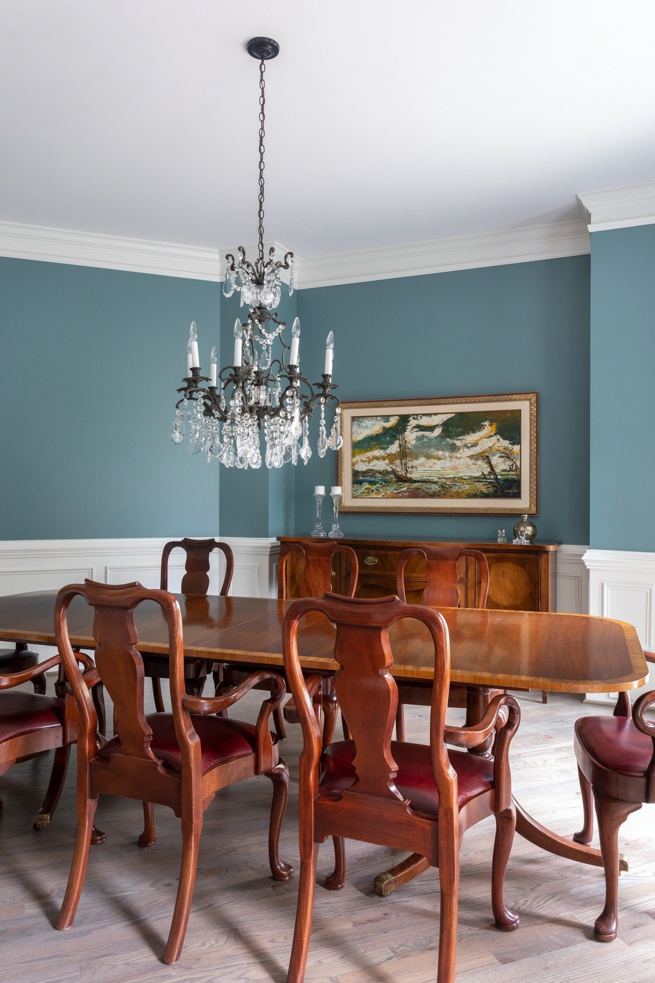
We changed the art and that was it. The lighter floors with the paint color changed the look.
This home is now a wonderful place of refuge. The homeowners have a place to entertain family and friends. We were able to use what they already had and make it better!
- Comments
Leave a Reply Cancel reply
Morse Design is a premier interior design firm known for superior service and interiors that blend timeless sophistication and livable luxury—crafted exclusively for tenacious and tasteful homeowners who want to host, relax, and thrive in a space that feels distinctly their own.
back to the top >
+ Comments