Before and After of a Doctor's Office
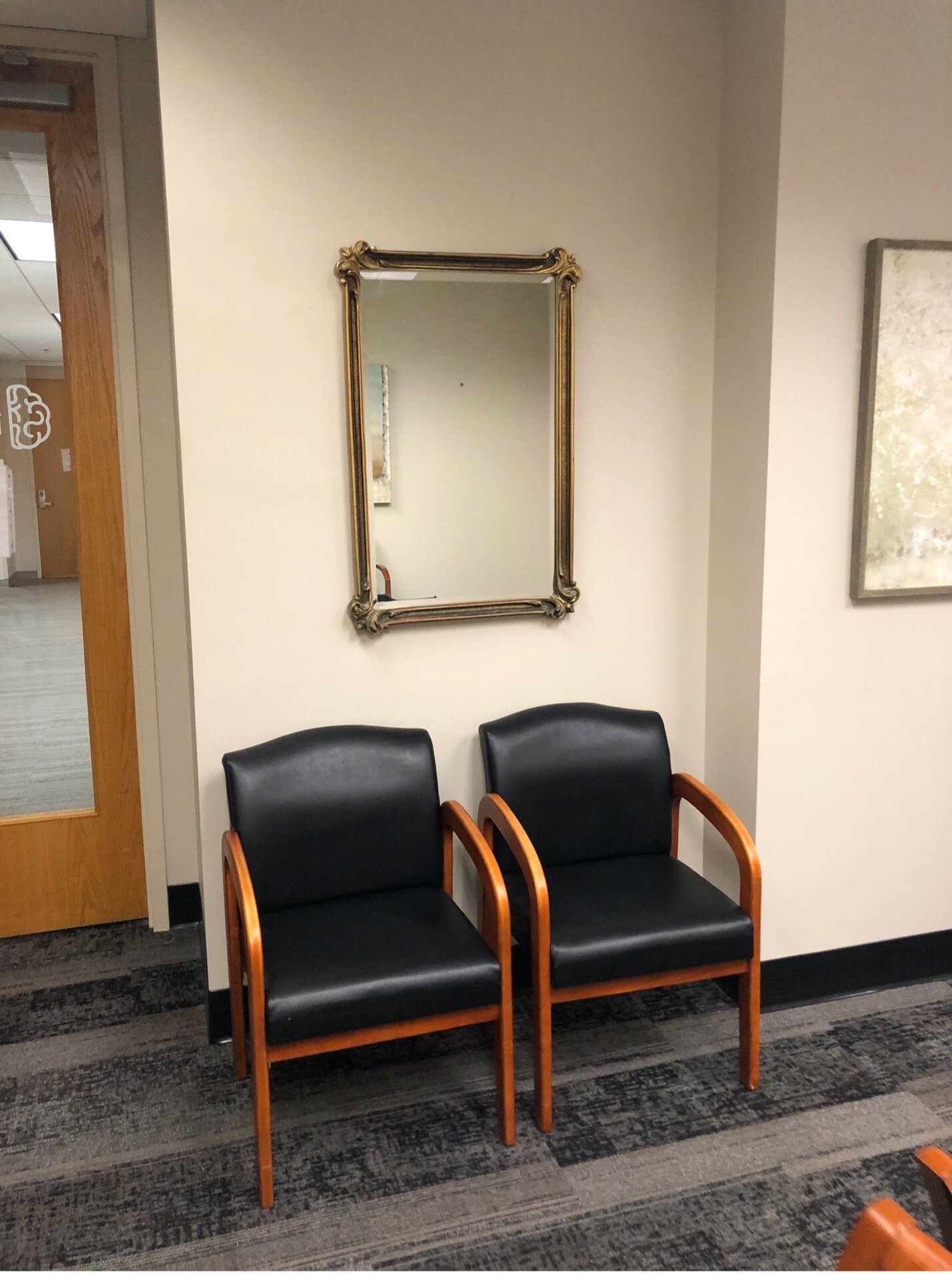
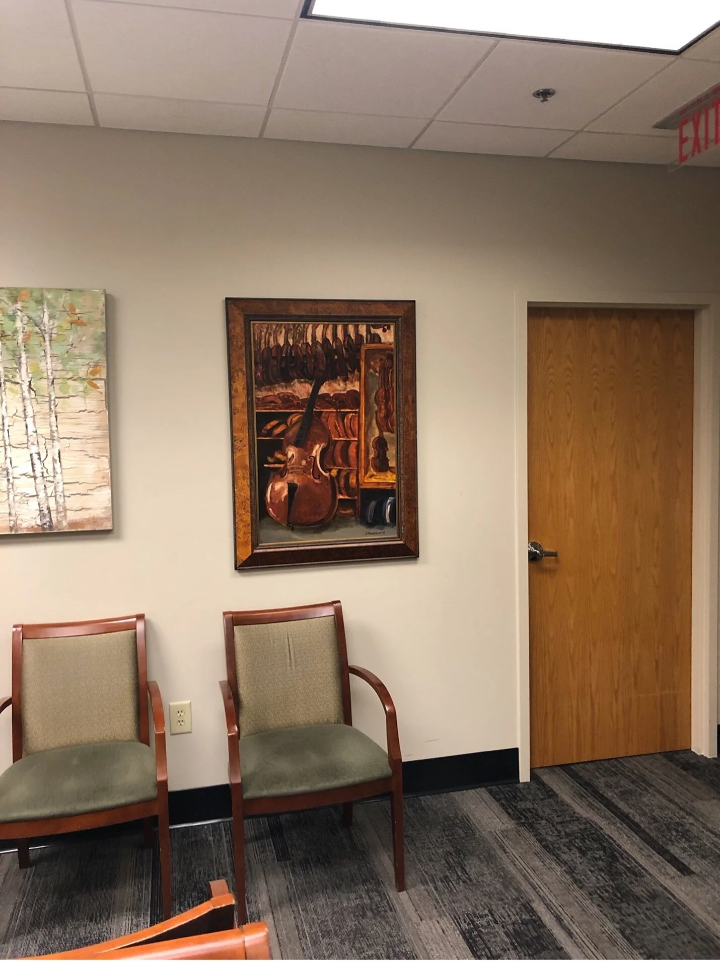
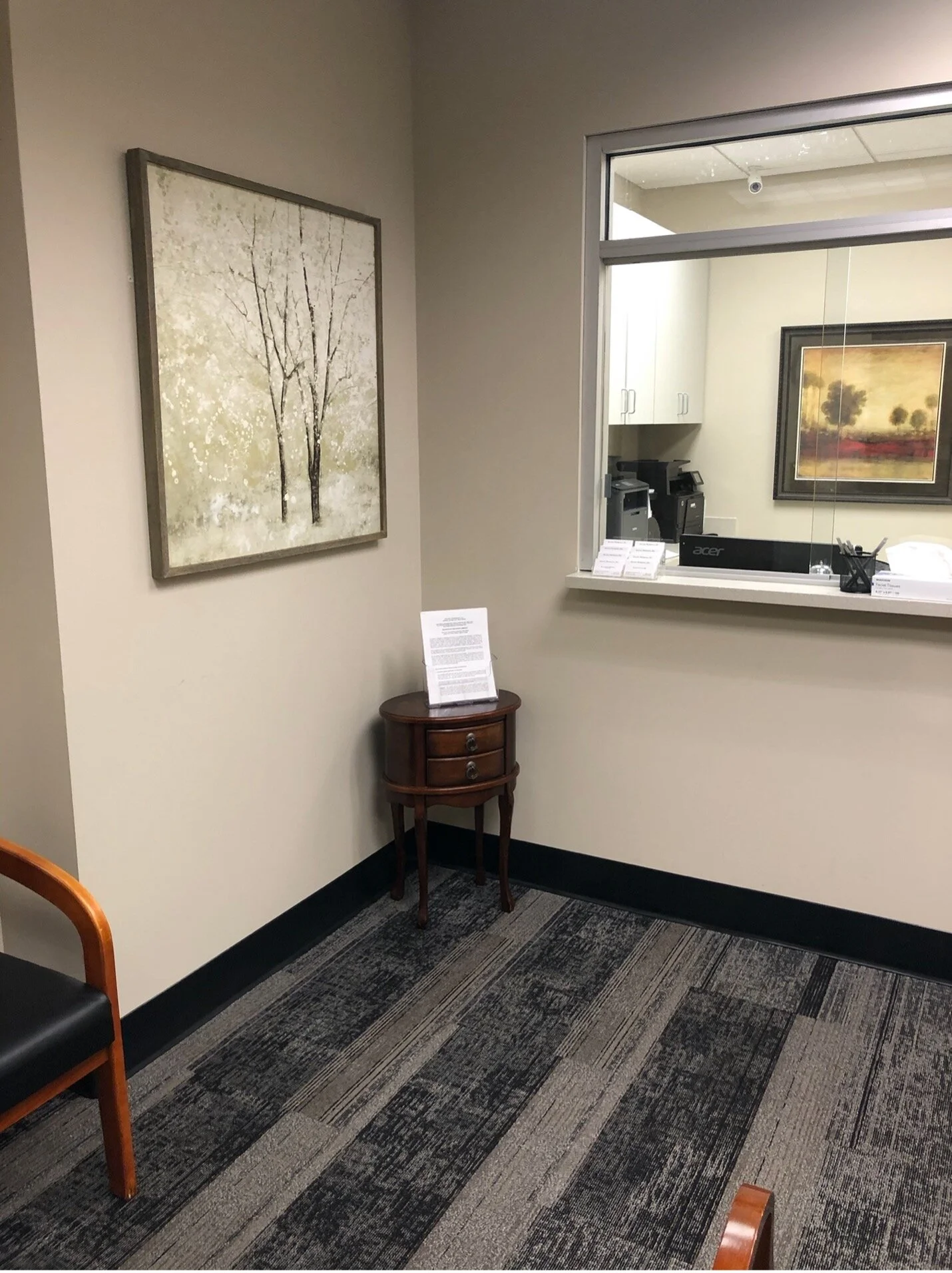
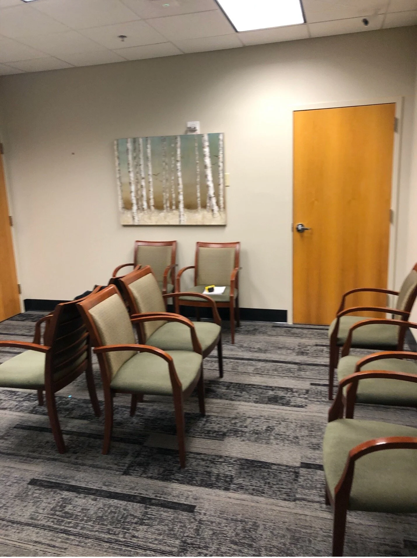
Before Covid, I feel like I am saying that a lot these days, I was working on a refurbish of a doctor’s office. This was my first contract space and I was so excited to get the opportunity! It is a smaller space, but I felt we could make it mighty and have it work better for the patients. The office had not been updated in years. It was dark, with old, brown, uncomfortable, waiting room furniture. At our first meeting I learned they wanted to incorporate some color which I thought was a great way to warm up the space. They had already picked out some carpet which had been installed before I came in to the picture. I was able to incorporate it into the new plan. Here are some pics of where we started when I began:
They were up for pretty much anything! The first idea that came to mind was to use some wallpaper! It would be a great way to add a lot of personality to the space. If anyone knows me, too, I happen to be a huge fan of wallpaper and love to incorporate it whenever I can! I found this wallpaper from Thibaut that had a lot of texture. It looks and feels like tree trunks.
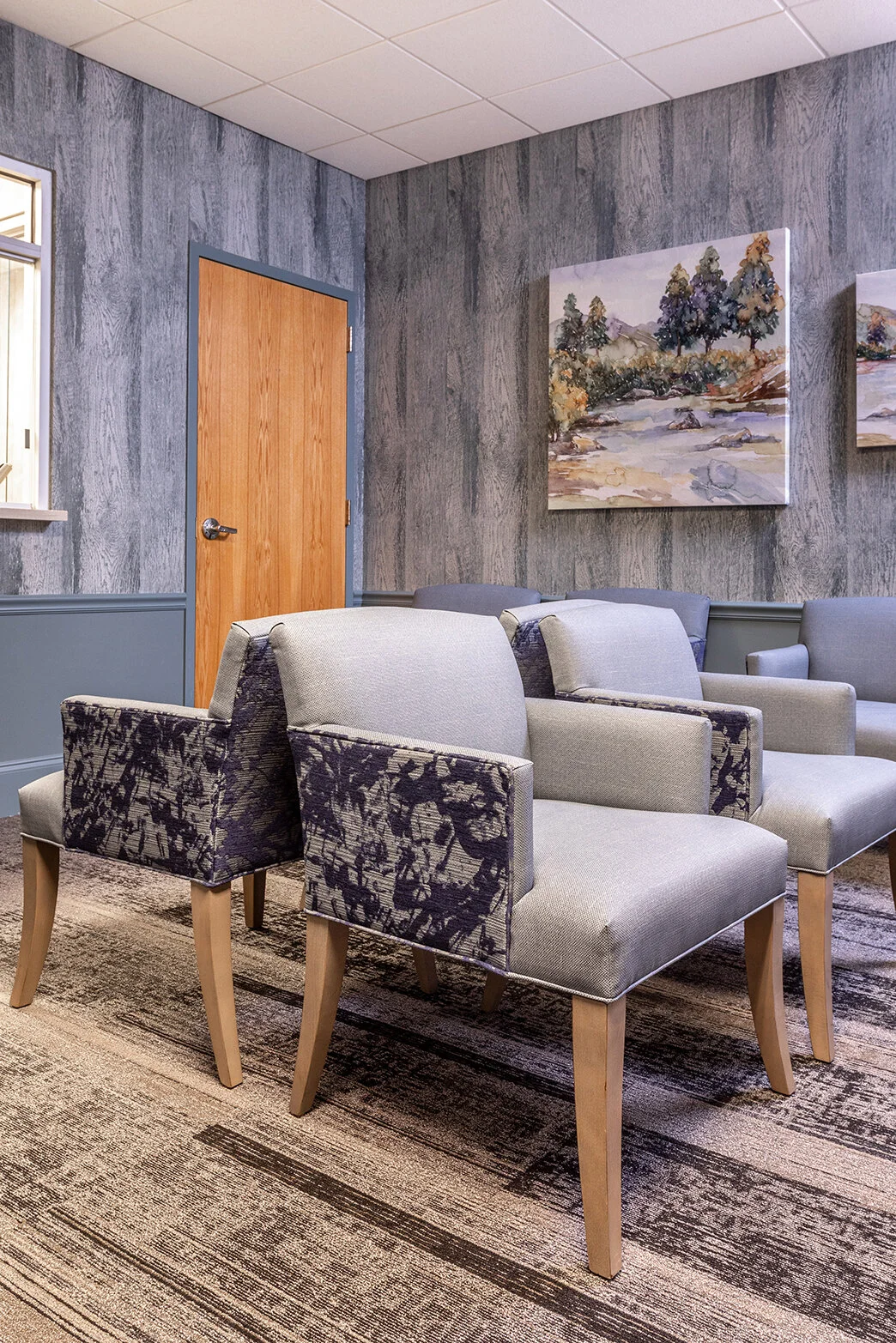
Can you see what I’m talking about? They loved this teal/blue color. We decided to break up the wallpaper by adding a chair rail. We placed the wallpaper above the trim and painted the lower half with a color that matched the wallpaper. It gives the effect of the entire wall being wallpapered. It saved us some money by not wallpapering the entire wall. We also added a wood baseboard and eliminated the black plastic trim that you see in lots of commercial spaces.
For the furniture, the office needed a lot of seating. It’s a small space so we had to pack a lot in the room. I found some really pretty chairs that were more petite in size, but were very comfortable. The office needed the chairs to withstand a lot of wear and tear, as well as possible incontinent issues from patients. I knew we needed a really strong fabric, but I wanted a pretty one, too. I found a great fabric that was wipeable and water resistant. It came in a beautiful color that coordinated with the walls of the office. To make the chairs prettier, we picked a print fabric to go on the outside of the chairs. It gave the chairs a 2 tone effect. A solid, durable fabric on the seat side of the chair and a pretty floral fabric on the outside of the chair. Both fabrics are contract grade so they will stand up to a lot of abuse. They turned out even better than I expected.
To break up the seating I ordered a sofa to flank a wall. It makes the space more interesting than just having chairs. The clients actually found the art to incorporate into the space.
Here is where the office ended up:
