"Make it Beautiful" Powder Bath Renovation Project
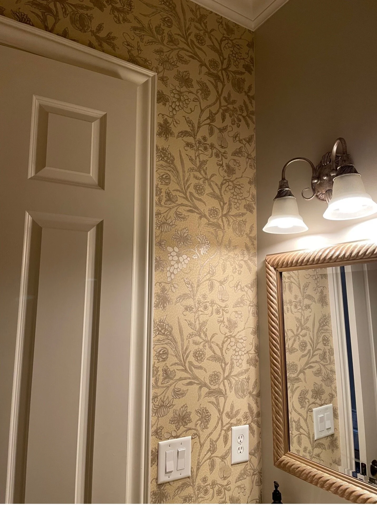
Recently, a client came to us for multiple projects with one of them being, as she quoted, “make my powder bath beautiful”. The powder bath was a tiny room, that had a very traditional, outdated wallpaper. It also had one painted wall. It had very little lighting and no personality. We were limited with the space, but that doesn’t mean we had to be limited with our creativity. Here is what the bathroom looked like when we started:
As you can see, one wall was painted and the other walls were wallpapered. The wallpaper, was a dingy, neutral that had zero personality. To top it off the space was very tight. Not a ton of room for much else.
The first task was to come up with a plan. I like having a complete plan for each space. It helps the client visualize what the finished space will look like and makes decision making much easier. Here is the plan I presented:
After the plan was approved I got to work. First, I ordered the vanity and toilet. Because the size of the space was small we couldn’t use a vanity with storage. We had to stick to a pedestal sink. We actually downsized to a smaller option that gave us a little more space in the bathroom. We used this one:
We also upgraded the toilet. We used this one:
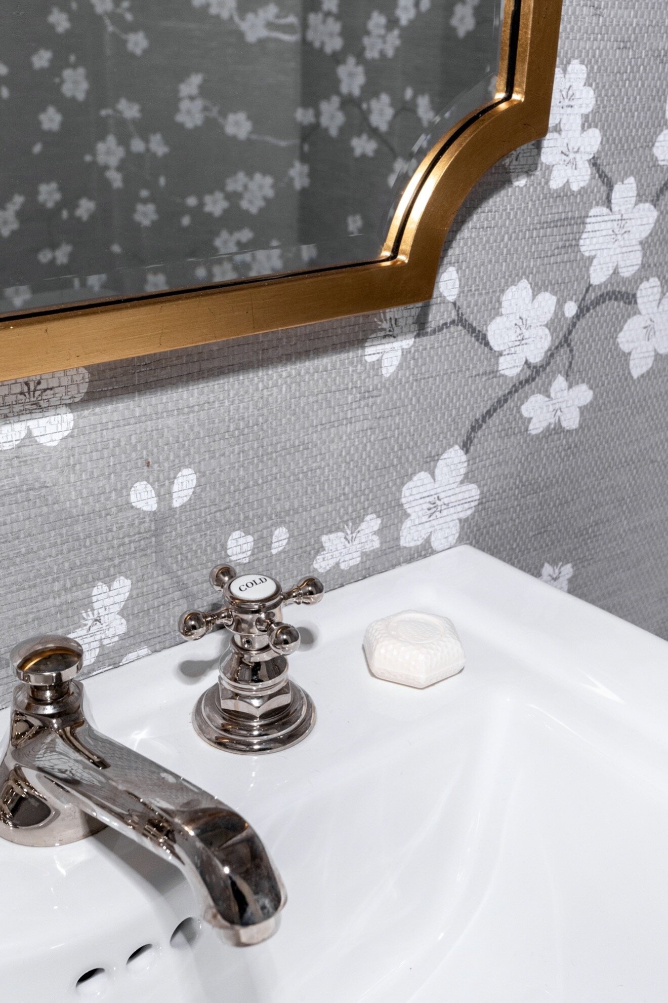
After ordering the necessities, the next task was to order the wallpaper. The client approved a wallpaper that would lighten up the space. It’s extra fun when we can incorporate texture into a room. We were able to do this with the wallpaper. I found the most beautiful grass cloth with a print on it. It was perfect for a powder bath. This is what we used:
Look at the lighting that was in the bathroom. There was no ceiling lights only this light over the mirror:
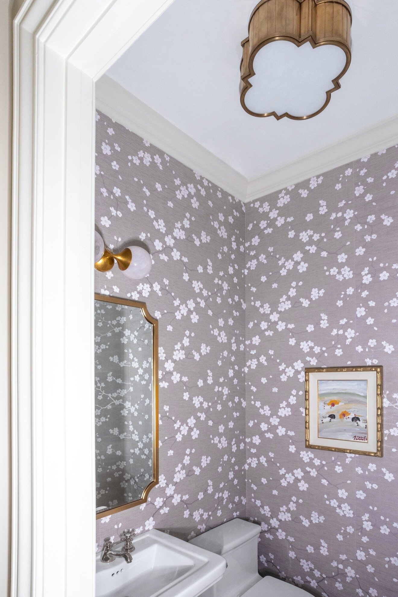
There was no natural light coming in here, so the bathroom was not bright. The only area that had any light was over the mirror. We suggested adding an additional light to the ceiling of the room. We found a gorgeous fixture that had some beautiful curves that would mimic the curves of the vines in the wallpaper. We added another light over the sink that tied in well with the celling light. Our original plan called for two scones to flank the mirror, but we soon realized that we could only use one due to the size of the space.
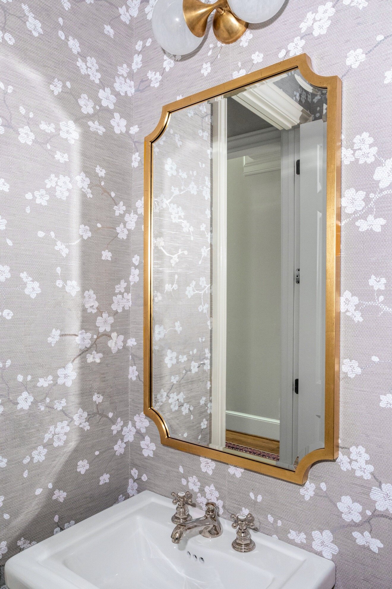
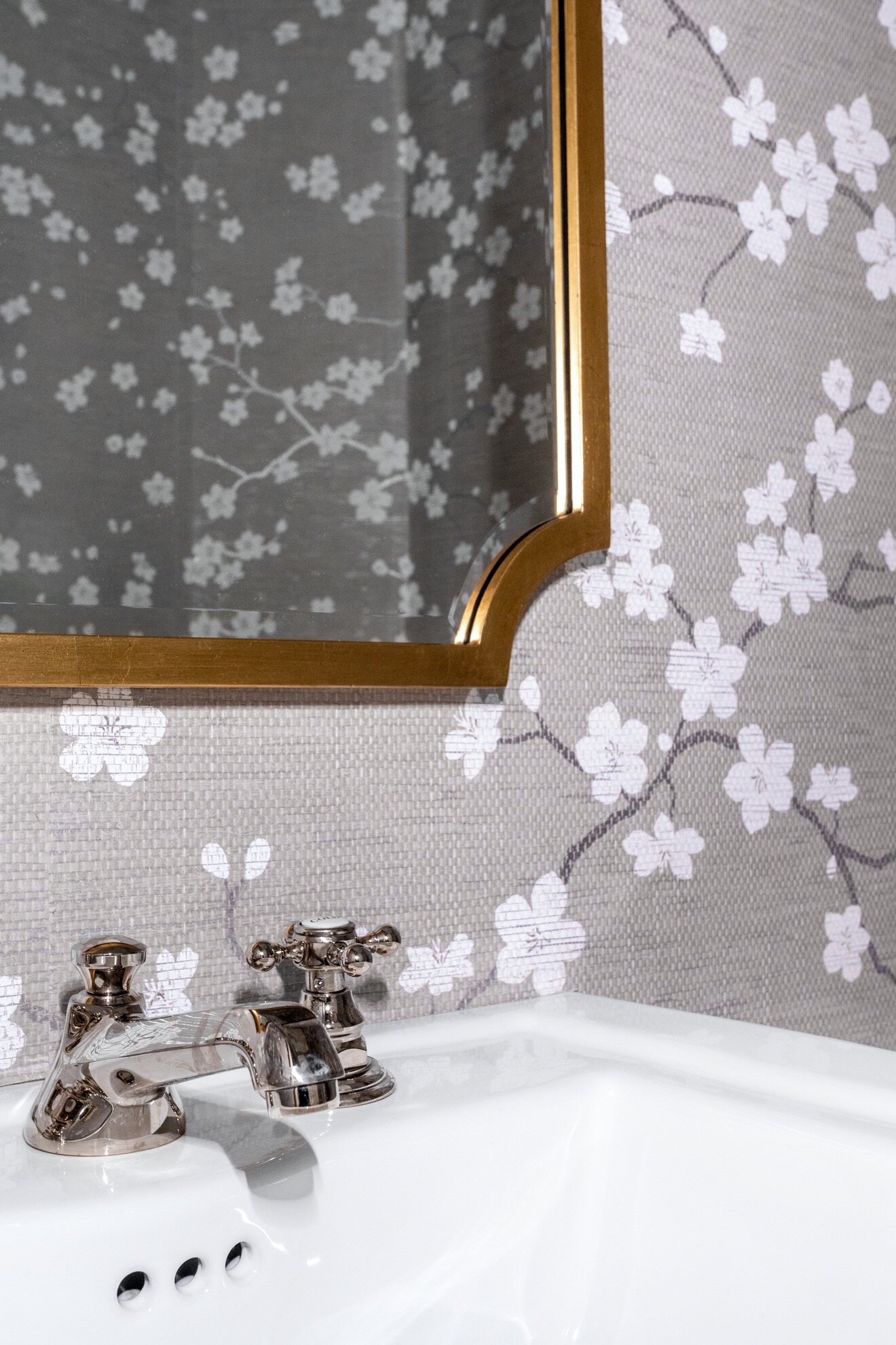
My client loves gold and I love nickel. It’s a great combination to be able to use both finishes. We used the nickel finish for the sink area and gold for everything else. Nickel tends to have a natural underlying gold tone. It works beautifully in combination with gold or brass finishes. Using a gold mirror was the finishing touch!
Look where we ended up:
We reframed a piece of art that my client’s mother had gifted to her and used the gold tones to tie it into the space.
Now the bathroom truly is beautiful!
